
In the digital age, the design of a website plays a pivotal role in shaping user experience and engagement. Creative web design layouts are not merely aesthetic choices; they are strategic decisions that can significantly influence how visitors interact with content. A well-crafted layout can guide users through a narrative, highlight key information, and create an emotional connection with the brand.
As the internet continues to evolve, so too do the expectations of users, who now seek visually appealing and functionally effective designs that resonate with their needs and preferences. The importance of creative web design layouts extends beyond mere visual appeal. They serve as the foundation for user navigation, content hierarchy, and overall usability.
Designers must consider various elements such as color schemes, typography, imagery, and spacing to create a cohesive experience. With the rise of mobile browsing, responsive design has become essential, ensuring that layouts adapt seamlessly across devices. This article will explore various creative web design layouts, each offering unique advantages and applications in the digital landscape.
Key Takeaways
- Creative web design layouts allow for unique and innovative designs that capture attention and engage users.
- Minimalist web design layouts focus on simplicity and clean aesthetics to create a modern and elegant look.
- Typography-focused web design layouts use typography as the main visual element to convey the message and create a strong visual impact.
- Grid-based web design layouts use a structured grid system to organize content and create a balanced and harmonious design.
- Parallax scrolling web design layouts create a sense of depth and movement by animating different layers of content as the user scrolls.
- Illustration-driven web design layouts use custom illustrations and graphics to add personality and visual interest to the design.
- Split-screen web design layouts divide the screen into two or more sections to showcase different content or create visual contrast.
- Interactive web design layouts engage users through interactive elements such as animations, hover effects, and clickable elements for a dynamic user experience.
Minimalist Web Design Layouts
Minimalist web design layouts emphasize simplicity and functionality, stripping away unnecessary elements to focus on core content. This approach is rooted in the belief that less is more; by reducing clutter, designers can enhance user experience and make navigation more intuitive. A minimalist layout often features ample white space, limited color palettes, and straightforward typography, allowing users to concentrate on the essential information without distractions.
Websites like Apple exemplify this design philosophy, showcasing products with clean lines and a focus on usability. The effectiveness of minimalist web design lies in its ability to convey messages clearly and concisely. For instance, a landing page designed with minimalism in mind can lead users directly to a call-to-action without overwhelming them with excessive information.
This approach not only improves readability but also fosters a sense of calm and order, which can be particularly beneficial for brands aiming to project sophistication and professionalism. Moreover, minimalist layouts often load faster due to their reduced complexity, enhancing overall performance and user satisfaction.
Typography-focused Web Design Layouts
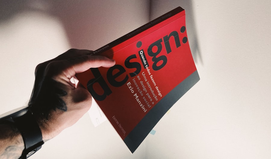
Typography-focused web design layouts prioritize text as a primary visual element, using typefaces to convey personality and tone. This approach recognizes that typography is not just about legibility; it is an art form that can evoke emotions and establish brand identity. Designers often experiment with font sizes, weights, and styles to create visual hierarchies that guide users through content.
Websites like Medium leverage typography to create immersive reading experiences, where the text itself becomes a focal point. Incorporating typography as a central design element allows for creative expression while maintaining functionality. For example, a website dedicated to literature might use elegant serif fonts to evoke a sense of tradition and sophistication, while a tech startup might opt for bold sans-serif fonts to convey modernity and innovation.
Additionally, effective use of typography can enhance accessibility; by choosing appropriate font sizes and contrasts, designers can ensure that content is readable for all users. This focus on typography not only enriches the visual experience but also reinforces the brand’s message through thoughtful text presentation.
Grid-based Web Design Layouts
Grid-based web design layouts utilize a structured framework to organize content systematically. This approach allows designers to create balanced compositions that enhance visual harmony and coherence. Grids provide a foundation for aligning elements consistently across a page, making it easier for users to navigate and digest information.
Websites like Pinterest exemplify grid-based layouts by presenting images in a modular format that adapts fluidly to different screen sizes. The versatility of grid-based layouts makes them suitable for various types of content, from portfolios to e-commerce sites. By employing a grid system, designers can create responsive designs that maintain their integrity across devices.
For instance, an online store can showcase products in a grid format that adjusts based on the user’s screen size, ensuring an optimal shopping experience regardless of whether the user is on a desktop or mobile device. Furthermore, grids facilitate the integration of multimedia elements, allowing for dynamic presentations that engage users visually while maintaining clarity.
Parallax Scrolling Web Design Layouts
Parallax scrolling web design layouts introduce depth and interactivity by creating an illusion of three-dimensional space as users scroll through a page. This technique involves layering background images at different speeds relative to foreground content, resulting in a captivating visual experience that draws users in. Websites like Nike have effectively utilized parallax scrolling to tell stories and showcase products in an engaging manner, transforming the act of scrolling into an immersive journey.
The appeal of parallax scrolling lies in its ability to create a narrative flow that captivates users’ attention. As visitors scroll down the page, they encounter various layers of content that unfold dynamically, encouraging exploration and interaction. This layout style is particularly effective for storytelling websites or those aiming to convey complex information in an engaging format.
However, designers must balance creativity with usability; excessive use of parallax effects can lead to performance issues or overwhelm users if not executed thoughtfully.
Illustration-driven Web Design Layouts
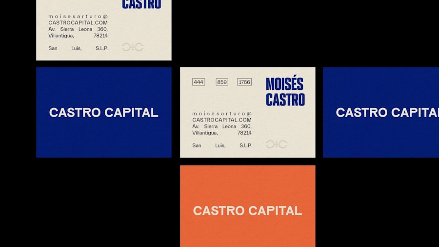
Illustration-driven web design layouts leverage custom illustrations to create unique visual identities that set brands apart from competitors. This approach allows for creative expression while conveying messages in a relatable manner. Illustrations can evoke emotions, simplify complex ideas, or add personality to a brand’s online presence.
Websites like Dropbox have successfully integrated illustrations into their designs, using them to explain features and enhance user engagement. The use of illustrations offers flexibility in design; they can be tailored to reflect a brand’s values and target audience effectively. For instance, a children’s educational website might employ playful and colorful illustrations to engage young learners, while a corporate site may opt for more sophisticated designs that convey professionalism.
Additionally, illustrations can enhance storytelling by providing visual context that complements written content. This synergy between text and imagery creates a cohesive narrative that resonates with users on multiple levels.
Split-screen Web Design Layouts
Split-screen web design layouts divide the screen into two or more distinct sections, allowing for simultaneous presentation of multiple content streams. This layout style is particularly effective for showcasing contrasting information or guiding users toward different actions without overwhelming them with choices. Websites like Spotify have utilized split-screen designs to highlight playlists alongside promotional content, creating an engaging user experience that encourages exploration.
The strategic use of split-screen layouts can enhance user engagement by presenting options side by side, making it easier for visitors to compare products or services. For example, an e-commerce site might use a split-screen layout to display two different product lines, allowing users to see features and prices at a glance. This approach not only improves usability but also encourages decision-making by providing clear visual cues.
However, designers must ensure that each section maintains its own identity while contributing to the overall coherence of the page.
Interactive Web Design Layouts
Interactive web design layouts prioritize user engagement through dynamic elements that respond to user actions. This approach transforms passive browsing into an active experience by incorporating features such as animations, hover effects, and interactive infographics. Websites like Awwwards showcase innovative interactive designs that captivate users and encourage exploration through engaging interactions.
The effectiveness of interactive layouts lies in their ability to create memorable experiences that resonate with users long after they leave the site. For instance, an educational platform might use interactive quizzes or simulations to enhance learning outcomes while keeping users engaged. Additionally, interactive elements can provide instant feedback, allowing users to see the results of their actions in real-time.
However, designers must strike a balance between interactivity and usability; overly complex interactions can lead to frustration if not implemented thoughtfully. In conclusion, creative web design layouts encompass a diverse range of approaches that cater to various user needs and preferences. From minimalist designs that prioritize clarity to interactive layouts that engage users actively, each style offers unique advantages in enhancing user experience and brand identity.
As technology continues to evolve, so too will the possibilities for innovative web design, pushing the boundaries of creativity and functionality in the digital realm.
If you’re interested in learning more about web design layouts, you may want to check out this article on 10 Essential Tips for Creating a User-Friendly Website Layout. This article provides valuable insights on how to design a website layout that is both visually appealing and easy to navigate. It covers important aspects such as color schemes, typography, and spacing to help you create a website that effectively communicates your brand message.
FAQs
What is a web design layout?
A web design layout refers to the way in which various elements are arranged on a web page. This includes the placement of text, images, navigation menus, and other content.
What are the different types of web design layouts?
There are several types of web design layouts, including fixed, fluid, responsive, and adaptive layouts. Each type has its own characteristics and is suited for different purposes.
What is a fixed web design layout?
A fixed web design layout has a set width and does not change regardless of the size of the browser window. This can lead to content being cut off on smaller screens.
What is a fluid web design layout?
A fluid web design layout is one that adjusts to the size of the browser window. This allows the layout to adapt to different screen sizes, but can result in uneven spacing and proportions.
What is a responsive web design layout?
A responsive web design layout is one that uses CSS media queries to adapt the layout to different screen sizes and devices. This ensures that the layout looks good and functions well on all devices.
What is an adaptive web design layout?
An adaptive web design layout is similar to a responsive layout, but instead of fluidly changing, it has specific layout sizes for different screen sizes. This can provide a more tailored experience for different devices.
How do web design layouts impact user experience?
Web design layouts can have a significant impact on user experience. A well-designed layout can make it easier for users to navigate a website and find the information they are looking for, while a poorly designed layout can lead to frustration and confusion.