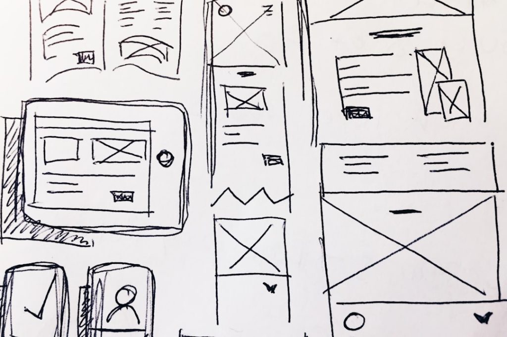
User experience (UX) in web design is a multifaceted discipline that focuses on enhancing user satisfaction by improving the usability, accessibility, and pleasure provided in the interaction between the user and the website. The importance of UX cannot be overstated; it serves as the backbone of effective web design, influencing how users perceive a brand and interact with its digital presence. A well-designed website not only attracts visitors but also retains them, guiding them seamlessly through their journey from discovery to conversion.
As the digital landscape evolves, understanding the principles of UX becomes increasingly critical for designers and businesses alike. At its core, user experience encompasses various elements, including layout, content, and functionality. It is about creating a holistic experience that resonates with users on both emotional and practical levels.
For instance, a website that is visually appealing yet difficult to navigate can frustrate users, leading to high bounce rates and lost opportunities. Conversely, a site that prioritizes user experience can foster loyalty and encourage repeat visits. As such, web designers must adopt a user-centered approach, employing research and testing to understand user needs and behaviors, ultimately crafting experiences that are not only functional but also enjoyable.
Key Takeaways
- User experience (UX) in web design focuses on creating a positive and meaningful experience for website visitors.
- Responsive design and mobile optimization are crucial for ensuring that websites are accessible and functional on all devices.
- Clear and intuitive navigation helps users easily find the information they are looking for on a website.
- Visual hierarchy and readability are important for guiding users’ attention and making content easy to consume.
- Interactive elements and micro-animations can enhance user engagement and create a more dynamic user experience.
Responsive Design and Mobile Optimization
In an era where mobile devices account for a significant portion of web traffic, responsive design has emerged as a fundamental principle in web development. Responsive design refers to the practice of creating websites that adapt seamlessly to various screen sizes and orientations, ensuring an optimal viewing experience across devices. This adaptability is crucial as users increasingly access websites from smartphones, tablets, and desktops.
A responsive website not only enhances usability but also improves search engine rankings, as search engines like Google prioritize mobile-friendly sites in their algorithms. Mobile optimization goes hand-in-hand with responsive design, focusing on enhancing the performance of websites on mobile devices. This includes optimizing images for faster loading times, simplifying navigation for touch interfaces, and ensuring that interactive elements are easily accessible.
For example, large buttons that are easy to tap can significantly improve the user experience on mobile devices. Additionally, mobile optimization involves considering the context in which users access content; for instance, users may be looking for quick information while on the go, necessitating concise content and straightforward navigation. By prioritizing responsive design and mobile optimization, web designers can create inclusive experiences that cater to the diverse needs of their audience.
Clear and Intuitive Navigation
Navigation is a critical component of user experience that directly impacts how users interact with a website. Clear and intuitive navigation allows users to find the information they seek quickly and efficiently. A well-structured navigation system typically includes a logical hierarchy of categories and subcategories, enabling users to understand the layout of the site at a glance.
For instance, e-commerce websites often employ a top-level menu that categorizes products by type, with dropdown menus providing further options. This structure not only aids in discoverability but also enhances the overall user experience by reducing frustration. Moreover, intuitive navigation extends beyond mere structure; it also encompasses the use of familiar conventions and visual cues.
Users have come to expect certain design patterns, such as a logo linking back to the homepage or a search bar prominently displayed at the top of the page. By adhering to these conventions, designers can create a sense of familiarity that eases navigation. Additionally, incorporating breadcrumb trails can help users understand their current location within the site’s hierarchy, allowing them to backtrack easily if needed.
Ultimately, clear and intuitive navigation is essential for guiding users through their journey on a website, ensuring they can access content without unnecessary obstacles.
Visual Hierarchy and Readability
Visual hierarchy is a fundamental principle in web design that dictates how elements are arranged on a page to guide users’ attention effectively. By strategically using size, color, contrast, and spacing, designers can create a clear path for users to follow as they consume content. For example, headlines are typically larger and bolder than body text, signaling their importance and drawing attention first.
Similarly, using contrasting colors for call-to-action buttons can make them stand out against the background, encouraging users to engage with them. Readability is another crucial aspect of visual hierarchy that directly affects user experience. A website’s typography should be carefully chosen to ensure that text is legible across different devices and screen sizes.
Factors such as font size, line height, and letter spacing all contribute to how easily users can read content. For instance, using sans-serif fonts for body text can enhance readability on screens due to their clean lines. Additionally, maintaining adequate contrast between text and background colors is essential for ensuring that content is accessible to all users, including those with visual impairments.
By prioritizing visual hierarchy and readability, designers can create engaging experiences that facilitate content consumption.
Interactive Elements and Micro-Animations
Interactive elements play a vital role in enhancing user engagement on websites. These elements can range from buttons and forms to sliders and image galleries. When designed thoughtfully, interactive components can make a website feel dynamic and responsive to user actions.
For instance, hover effects on buttons can provide immediate feedback when users interact with them, reinforcing the idea that their actions have consequences within the digital environment. Micro-animations are subtle animations that occur in response to user interactions or changes in state on a website. These animations serve multiple purposes: they can guide users through processes, provide visual feedback, or simply add an element of delight to the experience.
For example, when a user submits a form, a small animation indicating success—such as a checkmark appearing—can enhance satisfaction by confirming that their action was successful. Additionally, micro-animations can help draw attention to important information or calls to action without overwhelming users with excessive movement or distraction. By incorporating interactive elements and micro-animations thoughtfully into web design, designers can create engaging experiences that captivate users.
Personalization and Customization Options

Personalization in web design refers to tailoring content and experiences based on individual user preferences or behaviors. This approach enhances user engagement by making visitors feel valued and understood. For instance, e-commerce websites often utilize personalization algorithms to recommend products based on previous purchases or browsing history.
By presenting relevant suggestions, these sites can increase conversion rates while providing users with a more enjoyable shopping experience. Customization options allow users to modify aspects of their experience according to their preferences. This could include changing themes or layouts or adjusting settings such as font size or color schemes for better visibility.
For example, many news websites offer dark mode options for users who prefer reading in low-light conditions. Providing these customization features empowers users to create an experience that suits their needs while fostering a sense of ownership over their interaction with the site. By integrating personalization and customization options into web design, designers can enhance user satisfaction and loyalty.
Accessibility Features for All Users
Accessibility in web design ensures that all users, regardless of their abilities or disabilities, can access and interact with content effectively. This principle is not only a legal requirement in many jurisdictions but also an ethical obligation for designers who aim to create inclusive experiences. Implementing accessibility features involves adhering to established guidelines such as the Web Content Accessibility Guidelines (WCAG), which provide recommendations for making web content more accessible.
Key accessibility features include alternative text for images, which allows screen readers to convey information about visual content to visually impaired users. Additionally, ensuring keyboard navigability is crucial for individuals who cannot use a mouse; this means designing interactive elements that can be accessed through keyboard shortcuts alone. Color contrast is another important consideration; ensuring sufficient contrast between text and background colors helps users with visual impairments read content more easily.
By prioritizing accessibility features in web design, designers can create inclusive experiences that cater to all users while fostering a sense of community.
Testing and Iteration for Continuous Improvement
The process of testing and iteration is essential for refining user experience in web design. User testing involves gathering feedback from real users as they interact with a website or application. This feedback provides invaluable insights into pain points or areas where users may struggle to navigate or engage with content effectively.
Techniques such as A/B testing allow designers to compare different versions of a webpage or element to determine which performs better in terms of user engagement or conversion rates. Iteration is the practice of continuously improving designs based on user feedback and testing results. This cyclical process encourages designers to remain adaptable and responsive to changing user needs or preferences over time.
For example, if user testing reveals that visitors are consistently having difficulty finding specific information on a site, designers can adjust navigation structures or content placement accordingly. By embracing testing and iteration as integral components of the design process, web designers can ensure that their creations evolve alongside user expectations and technological advancements, ultimately leading to enhanced user experiences over time.
If you’re looking for some fresh web design ideas, you should check out this article on uprankerz.com. They offer valuable insights and tips on how to create a visually appealing and user-friendly website. Additionally, you may also want to explore their article on the latest trends in web design at uprankerz.com. By staying up-to-date with the latest trends and techniques, you can ensure that your website stands out from the competition and attracts more visitors.
FAQs
What are some popular web design ideas?
Some popular web design ideas include minimalist design, bold typography, vibrant colors, asymmetrical layouts, and immersive multimedia experiences.
How can I make my website more visually appealing?
You can make your website more visually appealing by using high-quality images, incorporating white space, choosing a cohesive color scheme, and utilizing modern design elements such as animations and interactive features.
What are some best practices for responsive web design?
Some best practices for responsive web design include using a mobile-first approach, optimizing images for different screen sizes, utilizing flexible grids and layouts, and testing the website on various devices and browsers.
What are some ways to improve user experience in web design?
To improve user experience in web design, you can focus on intuitive navigation, fast loading times, clear calls to action, accessible content, and mobile-friendly design.
How can I incorporate accessibility into my web design?
You can incorporate accessibility into your web design by using alt text for images, providing transcripts for audio and video content, ensuring proper color contrast for readability, and implementing keyboard navigation options.