
User experience (UX) is a critical component of web design that significantly influences how users interact with a website. It encompasses all aspects of the end-user’s interaction with the company, its services, and its products. A well-designed user experience can lead to increased customer satisfaction, higher conversion rates, and improved brand loyalty.
When users find a website easy to navigate, visually appealing, and responsive to their needs, they are more likely to engage with the content and return for future visits. Conversely, a poor user experience can drive potential customers away, resulting in lost opportunities and diminished brand reputation. The importance of user experience extends beyond mere aesthetics; it is fundamentally about understanding the needs and behaviors of users.
By conducting thorough research and employing user-centered design principles, designers can create interfaces that resonate with their target audience. This involves not only understanding what users want but also anticipating their needs and providing solutions that enhance their overall experience. For instance, e-commerce websites that streamline the checkout process and minimize the number of steps required to complete a purchase often see higher conversion rates.
This highlights the necessity of prioritizing user experience in the design process to foster engagement and drive business success.
Key Takeaways
- User experience is crucial for the success of a website, as it directly impacts user satisfaction and engagement.
- The right color scheme and typography can enhance the visual appeal and readability of a website, making it more appealing to users.
- Utilizing white space can create a clean and modern look, improving the overall user experience and making the content easier to consume.
- Responsive design is essential for ensuring that a website is compatible with mobile devices, reaching a wider audience and providing a seamless user experience.
- Intuitive navigation and user-friendly layouts are key for guiding users through the website and making it easy for them to find the information they need.
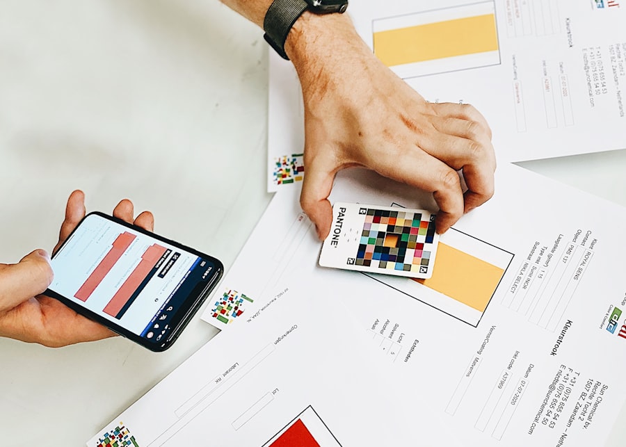
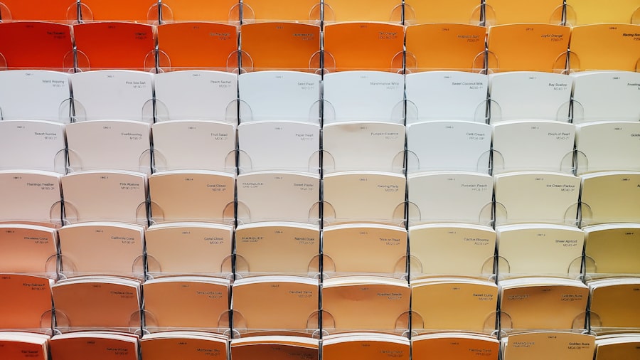
Choosing the Right Color Scheme and Typography
The selection of color schemes and typography plays a pivotal role in shaping the overall aesthetic and emotional impact of a website. Colors evoke emotions and can influence user behavior; therefore, choosing the right palette is essential for creating a cohesive brand identity. For example, blue is often associated with trust and professionalism, making it a popular choice for financial institutions, while vibrant colors like orange can evoke feelings of excitement and energy, suitable for brands targeting a younger audience.
Designers must consider not only the psychological implications of colors but also how they align with the brand’s message and values. Typography is equally important in establishing a website’s tone and readability. The choice of font can affect how users perceive the content; for instance, serif fonts are often seen as traditional and reliable, while sans-serif fonts convey a more modern and clean aesthetic.
Additionally, legibility is crucial; designers should ensure that text is easy to read across various devices and screen sizes. A well-chosen typeface can enhance the user experience by making content more accessible and engaging. Furthermore, maintaining consistency in font usage throughout the site reinforces brand identity and contributes to a polished look.
Utilizing White Space for a Clean and Modern Look
White space, or negative space, refers to the areas of a design that are left unmarked or empty. It is a powerful tool in web design that can significantly enhance the overall user experience by creating a sense of balance and clarity. By strategically incorporating white space, designers can guide users’ attention to key elements on the page, such as calls to action or important information.
This not only improves readability but also reduces cognitive overload, allowing users to process information more efficiently. In addition to improving usability, white space contributes to a modern aesthetic that many users find appealing. A cluttered design can overwhelm visitors and lead to frustration, while a clean layout with ample white space fosters a sense of calm and order.
For example, websites like Apple utilize white space effectively to highlight their products and create an elegant browsing experience. By allowing elements to breathe within the layout, designers can create an inviting atmosphere that encourages exploration and engagement.
Incorporating Responsive Design for Mobile Compatibility
With the increasing prevalence of mobile devices, responsive design has become an essential aspect of web development. Responsive design ensures that a website adapts seamlessly to various screen sizes and orientations, providing an optimal viewing experience across devices. This approach not only enhances usability but also improves search engine rankings, as search engines like Google prioritize mobile-friendly sites in their algorithms.
Implementing responsive design involves using flexible grids, images, and CSS media queries to create layouts that adjust dynamically based on the user’s device. For instance, a website designed with responsive principles will rearrange its content to fit smaller screens without sacrificing functionality or aesthetics. This adaptability is crucial in today’s digital landscape, where users expect to access information quickly and easily from their smartphones or tablets.
By prioritizing mobile compatibility through responsive design, businesses can reach a broader audience and ensure that their content is accessible to all users.
Implementing Intuitive Navigation and User-Friendly Layouts
Intuitive navigation is fundamental to creating a positive user experience on any website. Users should be able to find what they are looking for quickly and effortlessly; otherwise, they may become frustrated and leave the site altogether. A well-structured navigation system includes clear labels, logical categorization of content, and easily accessible menus.
For example, e-commerce sites often employ mega menus that allow users to browse through various product categories without feeling overwhelmed. User-friendly layouts further enhance navigation by organizing content in a way that aligns with users’ expectations. Designers should consider how users typically interact with websites and structure information accordingly.
For instance, placing important information above the fold ensures that it is immediately visible without requiring excessive scrolling. Additionally, incorporating visual cues such as arrows or icons can guide users through the site effectively. By focusing on intuitive navigation and user-friendly layouts, designers can create an environment where users feel comfortable exploring content without confusion.
Optimizing Images and Graphics for Fast Loading Times
In an era where speed is paramount, optimizing images and graphics for fast loading times is crucial for maintaining user engagement. Large image files can significantly slow down page load times, leading to higher bounce rates as users abandon sites that take too long to display content. To combat this issue, designers should employ various techniques such as compressing images without sacrificing quality, using appropriate file formats (like JPEG for photographs and PNG for graphics), and implementing lazy loading techniques that only load images as they come into view.
Moreover, optimizing images contributes not only to performance but also to overall user experience. A website that loads quickly allows users to access information promptly, which is particularly important for mobile users who may be on limited data plans or slower connections. For example, news websites often prioritize speed by using optimized images alongside text-heavy content to ensure that users receive updates in real-time without delays.
By focusing on image optimization, designers can create visually appealing websites that do not compromise on performance.
Integrating Call-to-Action Buttons for Conversion Optimization
Call-to-action (CTA) buttons are essential elements in web design that guide users toward desired actions, such as signing up for a newsletter or making a purchase. The effectiveness of CTAs hinges on their visibility, wording, and placement within the layout. A well-designed CTA button should stand out from the surrounding content through contrasting colors or strategic positioning on the page.
For instance, placing CTAs above the fold ensures they are immediately visible without requiring scrolling. The wording of CTA buttons also plays a significant role in conversion optimization. Action-oriented language that conveys urgency or value can motivate users to take action.
Phrases like “Get Started Now” or “Claim Your Discount” create a sense of immediacy that encourages clicks. Additionally, A/B testing different variations of CTAs can provide valuable insights into what resonates best with users. By integrating effective call-to-action buttons into web design, businesses can significantly enhance their conversion rates and drive user engagement.
Testing and Iterating for Continuous Improvement
The process of web design does not end with the launch of a site; rather, it requires ongoing testing and iteration to ensure optimal performance and user satisfaction. User feedback is invaluable in identifying areas for improvement; designers should actively seek input through surveys or usability testing sessions to gain insights into how real users interact with the site. This feedback can inform design decisions and help prioritize updates based on user needs.
A/B testing is another powerful method for refining web design elements over time. By comparing two versions of a webpage—such as different layouts or color schemes—designers can analyze user behavior metrics like click-through rates or time spent on page to determine which version performs better. This data-driven approach allows for informed decision-making that enhances user experience continuously.
As technology evolves and user preferences shift, embracing a culture of testing and iteration ensures that websites remain relevant and effective in meeting user needs over time.
If you’re looking for more web design tips, you should check out this article on web design tips for a stunning site . This article provides valuable insights and advice for those just starting out in the world of web design. It covers everything from choosing the right color scheme to creating a user-friendly layout. By following these tips, you can create a visually appealing and functional website that will attract and engage your target audience.
FAQs
What are some important web design tips to keep in mind?
Some important web design tips to keep in mind include creating a clean and intuitive layout, using high-quality images, ensuring mobile responsiveness, optimizing for speed, and maintaining consistency in design elements.
Why is it important to have a clean and intuitive layout in web design?
A clean and intuitive layout is important in web design because it helps users navigate the website easily, find the information they are looking for, and have a positive user experience.
How can high-quality images enhance web design?
High-quality images can enhance web design by making the website visually appealing, capturing the attention of users, and conveying the brand’s message effectively.
What does it mean to ensure mobile responsiveness in web design?
Ensuring mobile responsiveness in web design means that the website is designed to adapt and display properly on various devices, such as smartphones and tablets, providing a seamless user experience across different screen sizes.
Why is it important to optimize for speed in web design?
Optimizing for speed in web design is important because it improves the website’s performance, reduces bounce rates, and enhances user satisfaction. Fast-loading websites also tend to rank higher in search engine results.
How does maintaining consistency in design elements contribute to effective web design?
Maintaining consistency in design elements, such as colors, fonts, and spacing, contributes to effective web design by creating a cohesive and professional look, reinforcing brand identity, and improving overall user experience.