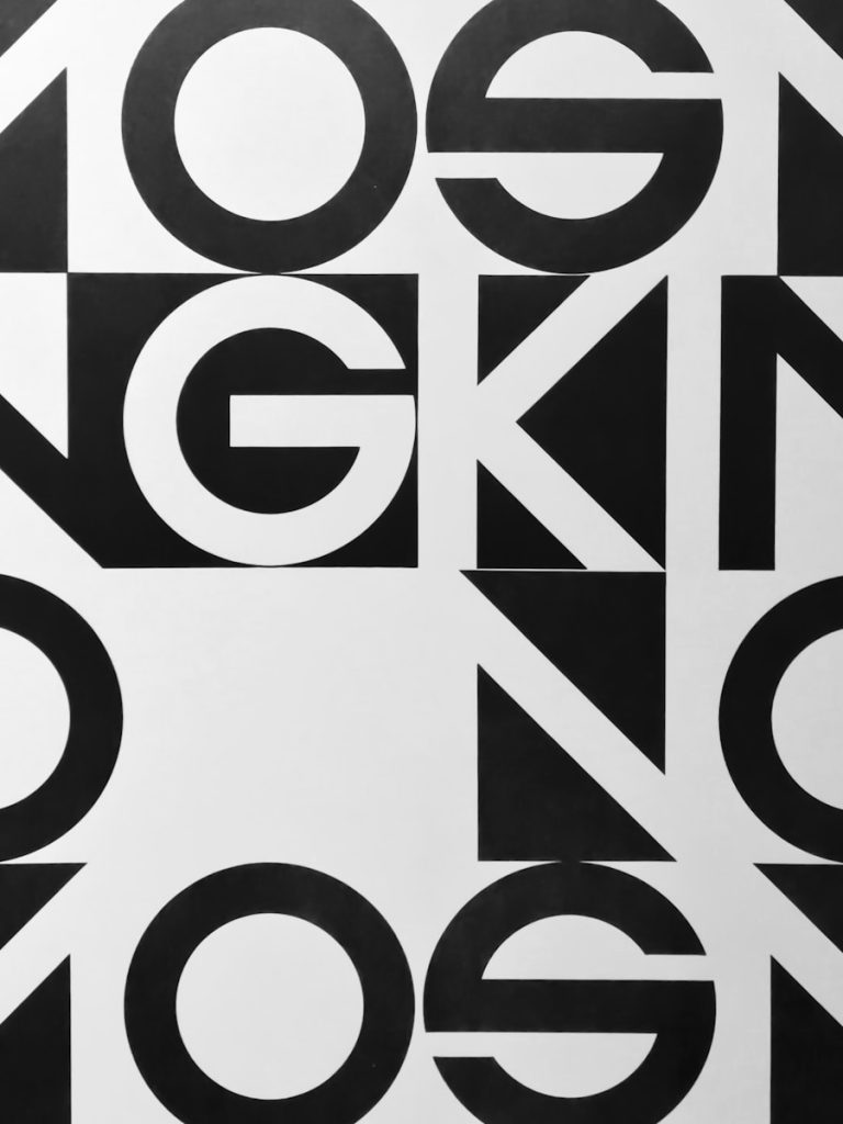
Typography is a fundamental element of web design that transcends mere aesthetics; it serves as a critical communication tool that shapes how users perceive and interact with content. The choice of typeface, font size, line spacing, and color can significantly influence the overall effectiveness of a website. In an era where attention spans are dwindling, the ability to convey information quickly and clearly is paramount.
Typography not only enhances the visual appeal of a site but also plays a pivotal role in guiding users through their journey, making it easier for them to find the information they seek. Moreover, typography can establish a hierarchy within the content, allowing users to navigate through various sections effortlessly. By utilizing different font sizes and weights, designers can create a visual roadmap that directs attention to key messages or calls to action.
For instance, larger headings can signal the start of new sections, while smaller body text provides supporting details. This strategic use of typography ensures that users can scan content efficiently, which is essential in a digital landscape where information overload is commonplace.
Key Takeaways
- Typography plays a crucial role in web design by enhancing the overall aesthetic and readability of a website.
- Typography is a key element in establishing brand identity, as it helps to convey the personality and values of a brand.
- The choice of typography can significantly impact user experience, as it affects how easily users can read and navigate a website.
- Typography also influences readability and accessibility, making it important to choose fonts that are easy to read and accessible to all users.
- Typography can be used to convey emotions and messages, allowing designers to evoke specific feelings and communicate effectively with users.
The Role of Typography in Establishing Brand Identity
The Power of Font Selection
A tech startup, for instance, might choose sleek, modern sans-serif to convey innovation and forward-thinking, while a luxury brand may opt for serif fonts to evoke sophistication and tradition.
Consistency Across Platforms
This careful attention to typography helps create a brand image that resonates with target audiences. Consistency in typography across various platforms, including websites, social media profiles, and marketing materials, fosters familiarity and trust.
A Lasting Impression
Brands that invest in thoughtful typography are more likely to leave a lasting impression on their audience, ultimately contributing to customer loyalty and engagement. This consistency not only aids in brand recall but also enhances the overall user experience by providing a seamless transition between different touchpoints.
How Typography Impacts User Experience

The user experience (UX) is heavily influenced by typography, as it affects how easily users can read and comprehend content. A well-designed typographic system can enhance usability by ensuring that text is legible and visually appealing. Factors such as font choice, size, line height, and contrast all play a role in creating an optimal reading experience.
For instance, using a font that is too small or poorly contrasted against the background can lead to frustration and disengagement. Conversely, thoughtfully chosen typography can invite users to explore content further. Furthermore, typography can set the tone for the entire website experience.
A playful font may create a sense of fun and approachability, while a more formal typeface can establish authority and professionalism. This tonal alignment is crucial in guiding user expectations and shaping their interactions with the site. For example, an educational platform might use clear, straightforward typography to promote clarity and understanding, while an art gallery website might employ more creative fonts to reflect its artistic mission.
By aligning typography with user expectations and content goals, designers can create a more engaging and satisfying experience.
The Influence of Typography on Readability and Accessibility
Readability is a critical aspect of web design that directly impacts how effectively users can consume information. Typography plays a significant role in this regard, as certain fonts are inherently more readable than others. For instance, serif fonts are often considered more legible in print due to their distinct letterforms, while sans-serif fonts are favored for digital screens because of their clean lines and simplicity.
Designers must consider the medium when selecting typefaces to ensure optimal readability across devices. Accessibility is another vital consideration when it comes to typography. Websites must be designed to accommodate users with varying abilities, including those with visual impairments or dyslexia.
Implementing best practices such as using sufficient contrast between text and background colors, providing alternative text for images, and choosing fonts that are easy to read can significantly enhance accessibility. Additionally, employing responsive typography that adjusts based on screen size ensures that all users have an equitable experience regardless of the device they are using.
Using Typography to Convey Emotions and Messages
Typography is not just about conveying information; it also serves as a powerful tool for expressing emotions and messages. Different typefaces carry distinct connotations that can influence how users perceive content. For example, bold and angular fonts may evoke feelings of strength and confidence, while softer, rounded fonts can create a sense of warmth and friendliness.
This emotional resonance is particularly important in marketing and branding efforts, where the goal is often to connect with audiences on a deeper level. Designers can leverage typography to reinforce specific messages or themes within their content. For instance, a charity organization might use compassionate and approachable fonts to convey empathy and support for their cause.
In contrast, a financial institution may opt for strong, authoritative typefaces to instill trust and reliability in their services. By carefully selecting typography that aligns with the intended emotional response, designers can enhance the overall impact of their messaging.
Typography Trends in Web Design
The world of web design is ever-evolving, with typography trends reflecting broader cultural shifts and technological advancements. One notable trend is the rise of variable fonts, which allow designers to manipulate weight, width, and other attributes within a single font file. This flexibility not only streamlines web performance by reducing the number of font files needed but also enables more creative expression in typography design.
Another trend gaining traction is the use of oversized typography as a focal point in web design. Large headlines can create visual impact and draw users’ attention immediately upon landing on a page. This approach aligns with minimalist design principles, where less clutter allows for greater emphasis on key messages.
Additionally, the integration of custom fonts has become increasingly popular as brands seek unique typographic identities that set them apart from competitors.
Best Practices for Choosing and Using Typography in Web Design
When selecting typography for web design projects, several best practices should be considered to ensure effectiveness and coherence. First and foremost, designers should prioritize legibility by choosing fonts that are easy to read across various devices and screen sizes. This often involves testing different typefaces in real-world scenarios to gauge user response.
Another essential practice is maintaining consistency throughout the design by establishing a typographic hierarchy. This involves defining styles for headings, subheadings, body text, and other elements to create a cohesive visual language. By adhering to this hierarchy, designers can guide users through content seamlessly while reinforcing brand identity.
Additionally, designers should be mindful of color choices when it comes to typography. High contrast between text and background enhances readability while ensuring accessibility for all users. Furthermore, incorporating ample white space around text elements can improve focus and reduce cognitive load.
The Future of Typography in Web Design
As technology continues to advance at an unprecedented pace, the future of typography in web design holds exciting possibilities. One area poised for growth is the integration of artificial intelligence (AI) in font selection and customization processes. AI-driven tools could analyze user behavior and preferences to recommend typefaces that resonate with specific audiences or contexts.
Moreover, as virtual reality (VR) and augmented reality (AR) technologies become more mainstream, typography will need to adapt to new environments where traditional reading patterns may not apply. Designers will face unique challenges in ensuring legibility within immersive experiences while maintaining brand identity. The ongoing evolution of web standards will also influence typography’s future trajectory.
As browsers become more capable of rendering complex typographic features—such as ligatures or variable fonts—designers will have greater freedom to experiment with innovative typographic solutions that enhance user engagement. In conclusion, typography remains an essential pillar of web design that influences brand identity, user experience, readability, accessibility, emotional communication, trends, best practices, and future innovations. As designers continue to explore the nuances of typography in digital spaces, its significance will only grow in shaping how we interact with information online.
FAQs
What is typography in web design?
Typography in web design refers to the style, arrangement, and appearance of text on a website. It includes the selection of fonts, font sizes, spacing, and other design elements that contribute to the overall visual appeal and readability of the text.
Why is typography important in modern web design?
Typography plays a crucial role in modern web design as it directly impacts the user experience. Well-chosen typography can enhance the readability of the content, establish the website’s visual identity, and create a cohesive and professional look and feel.
How does typography affect user experience on a website?
Typography affects user experience by influencing how easily users can read and understand the content on a website. Clear and well-designed typography can make the content more accessible and engaging, while poor typography choices can lead to user frustration and a negative perception of the website.
What are some best practices for typography in modern web design?
Some best practices for typography in modern web design include choosing legible fonts, establishing a clear hierarchy of text elements, maintaining consistent typography across the website, using appropriate font sizes and line spacing, and considering responsive design to ensure readability on various devices.
How can typography contribute to branding on a website?
Typography can contribute to branding on a website by reflecting the brand’s personality and values. By selecting fonts that align with the brand’s identity, typography can help establish a strong visual connection with the audience and reinforce the brand’s overall image and messaging.