
Crafting Effective Service Web Design
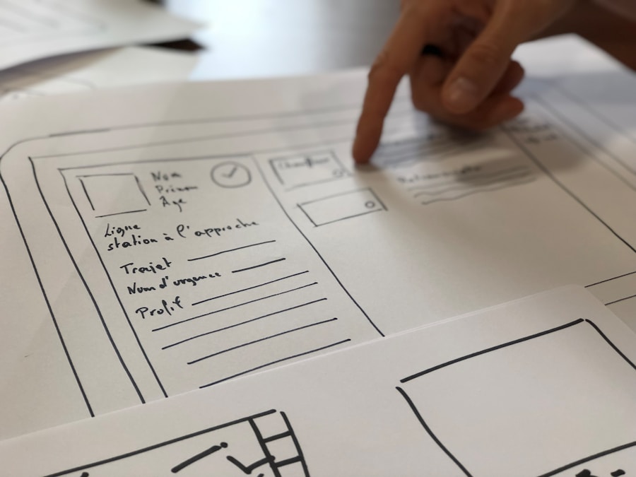
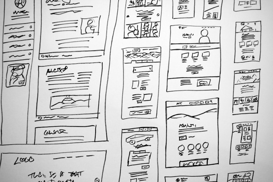
User experience (UX) is a multifaceted concept that encompasses every interaction a user has with a product, service, or system. In the digital realm, this often translates to how users interact with websites and applications. A deep understanding of user experience involves recognizing the needs, preferences, and behaviors of users. This understanding is critical because it informs design decisions that can significantly impact user satisfaction and engagement. For instance, research shows that users are more likely to abandon a website if they encounter difficulties navigating it or if it fails to meet their expectations in terms of speed and functionality. To truly grasp the essence of user experience, one must consider various elements such as usability, accessibility, and emotional response. Usability refers to how easy and intuitive a website is to use, while accessibility ensures that all users, including those with disabilities, can interact with the site effectively. Emotional response plays a crucial role as well; users often form judgments based on their feelings during their interactions. A website that evokes positive emotions through its design and functionality can foster loyalty and encourage repeat visits. Therefore, understanding user experience is not merely about aesthetics; it is about creating a holistic environment that resonates with users on multiple levels. Key Takeaways Understanding the user experience is crucial for creating a successful website. Clear and intuitive navigation is essential for guiding users through the website. Utilizing responsive design is important for ensuring mobile accessibility. Compelling visuals and graphics can enhance the user experience and engagement. User-friendly forms and contact information are key for facilitating communication with users. Creating Clear and Intuitive Navigation Streamlining Access to Content A simple and logical navigation structure can significantly enhance user experience. For instance, a top navigation bar with categorized content can help users find what they need quickly. Dropdown menus can further streamline access to subcategories, reducing the number of clicks required to reach specific areas of interest. Navigation Placement and Conventions The placement of navigation elements is critical to usability. Users typically expect navigation menus to be located at the top or on the left side of a webpage. Deviating from these conventions can lead to user frustration and increased bounce rates. Additionally, incorporating breadcrumb trails can provide users with context about their current location within the site hierarchy, making it easier for them to backtrack if needed. Empowering Users through Intuitive Navigation By prioritizing clear and intuitive navigation, designers can create an environment where users feel empowered to explore and engage with content without barriers. This, in turn, can lead to increased user satisfaction, longer session times, and ultimately, a more successful website. Utilizing Responsive Design for Mobile Accessibility In an era where mobile devices dominate internet usage, responsive design has become a necessity rather than an option. Responsive design ensures that websites adapt seamlessly to various screen sizes and orientations, providing an optimal viewing experience across devices. This approach not only enhances usability but also improves search engine rankings, as search engines like Google prioritize mobile-friendly sites in their algorithms. For instance, a responsive website will automatically adjust its layout, images, and text size based on the device being used, ensuring that users have a consistent experience whether they are on a smartphone, tablet, or desktop. The importance of mobile accessibility cannot be overstated. With statistics indicating that over half of all web traffic comes from mobile devices, neglecting this aspect can lead to significant losses in potential customers. A responsive design also contributes to faster loading times on mobile devices, which is crucial for retaining users who may abandon a site if it takes too long to load. By embracing responsive design principles, businesses can cater to the growing mobile audience while enhancing overall user satisfaction. Incorporating Compelling Visuals and Graphics Visual elements play a critical role in capturing user attention and conveying information effectively. Compelling visuals and graphics can enhance the overall aesthetic appeal of a website while also serving functional purposes. High-quality images, infographics, and videos can break up text-heavy content, making it more digestible and engaging for users. For example, an e-commerce site showcasing products with vibrant images allows potential buyers to visualize items better, ultimately influencing their purchasing decisions. Furthermore, the strategic use of visuals can guide users through their journey on a website. For instance, incorporating arrows or highlighted areas in graphics can direct attention to key features or calls to action. Consistency in visual style—such as color schemes and typography—also contributes to brand identity and recognition. By thoughtfully integrating compelling visuals into web design, businesses can create an immersive experience that resonates with users and encourages them to explore further. Implementing User-Friendly Forms and Contact Information Forms are often essential for gathering user information or facilitating communication between businesses and customers. However, poorly designed forms can lead to frustration and abandonment. To create user-friendly forms, it is crucial to keep them simple and concise. Limiting the number of fields required for submission can significantly increase completion rates. For instance, asking only for essential information such as name and email address for newsletter sign-ups can encourage more users to engage without feeling overwhelmed by lengthy forms. Additionally, providing clear labels and instructions for each field can enhance usability. Users should understand what information is required without ambiguity. Incorporating real-time validation—where users receive immediate feedback on their input—can also improve the experience by preventing errors before submission. Furthermore, ensuring that contact information is easily accessible throughout the site fosters trust and encourages users to reach out with inquiries or feedback. Optimizing Site Speed and Performance Site speed is a critical factor that directly impacts user experience and engagement levels. Research indicates that even a one-second delay in page load time can lead to significant drops in conversion rates. Users today expect websites to load quickly; if they encounter delays, they are likely to abandon the site in favor of faster alternatives. To optimize site speed, web developers should focus on minimizing file sizes for images and scripts
Crafting Effective Service Web Design Read More »