Web design

Photo web design

The Best Program for Web Design: Adobe Dreamweaver

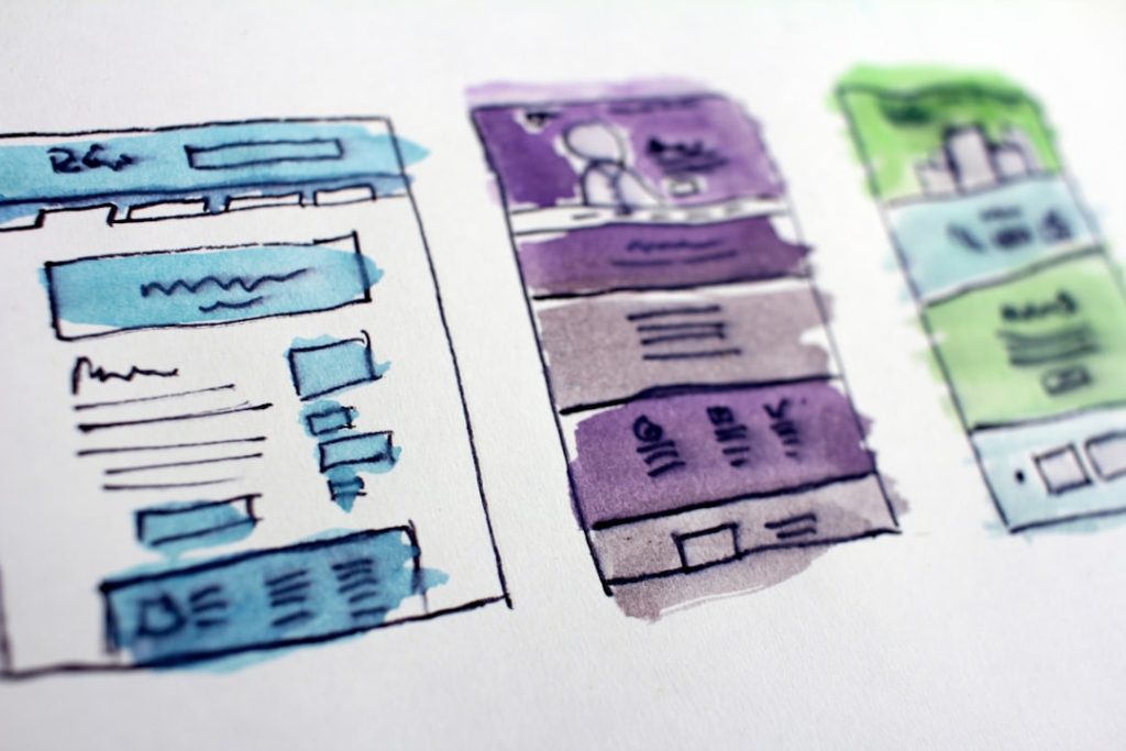
Adobe Dreamweaver has long been a cornerstone in the realm of web design and development, offering a robust platform for both novice and experienced developers. Launched initially in 1997, it has evolved significantly over the years, adapting to the changing landscape of web technologies and user expectations. Dreamweaver provides a comprehensive environment that combines visual design tools with powerful coding capabilities, making it an ideal choice for creating responsive websites and applications. Its versatility allows users to work with various programming languages, including HTML, CSS, JavaScript, and PHP, catering to a wide range of web development needs. The software’s dual approach—offering both a WYSIWYG (What You See Is What You Get) interface and a code editor—enables users to switch seamlessly between visual design and code editing. This flexibility is particularly beneficial for those who may not have extensive coding experience but still wish to create professional-quality websites. As web standards have evolved, so too has Dreamweaver, incorporating features that support modern frameworks and responsive design principles. This adaptability ensures that users can stay current with industry trends while leveraging the full power of Adobe’s creative suite. Key Takeaways Adobe Dreamweaver is a powerful web design and development tool that offers a wide range of features and customization options. The user interface of Adobe Dreamweaver is highly customizable, allowing users to tailor the workspace to their specific needs and preferences. Dreamweaver provides advanced code editing and syntax highlighting features, making it a preferred choice for developers and programmers. Integration with other Adobe Creative Cloud apps allows for seamless workflow and collaboration between different design and development tools. Dreamweaver’s built-in FTP and SFTP support, along with its extensibility and third-party integration, make it a versatile and efficient tool for web design and development. Features of Adobe Dreamweaver Adobe Dreamweaver is packed with features that enhance the web development process, making it a powerful tool for designers and developers alike. One of its standout features is the Fluid Grid Layout, which allows users to create responsive designs that automatically adjust to different screen sizes. This is particularly important in today’s mobile-first world, where users access websites from a variety of devices. The Fluid Grid Layout simplifies the process of designing for multiple platforms, enabling developers to create layouts that look great on desktops, tablets, and smartphones without needing to write extensive media queries manually. Another notable feature is the built-in support for CSS preprocessors like Sass and LESS. These tools allow developers to write more maintainable and scalable stylesheets by using variables, nesting, and mixins. Dreamweaver’s integration with these preprocessors streamlines the workflow, enabling users to compile their styles directly within the application. Additionally, the software supports Git version control, allowing teams to collaborate more effectively by tracking changes and managing code versions seamlessly. This integration is crucial for modern development practices, where collaboration and version management are essential for project success. User Interface and Customization Options The user interface of Adobe Dreamweaver is designed with usability in mind, providing a clean and intuitive workspace that caters to both beginners and seasoned professionals. The layout is highly customizable, allowing users to arrange panels and tools according to their preferences. This flexibility means that developers can create a workspace that suits their workflow, whether they prefer a minimalist setup or a more feature-rich environment filled with tools at their fingertips. Dreamweaver also offers a variety of themes and color schemes, enabling users to personalize their experience further. This customization extends beyond aesthetics; it also includes the ability to create custom snippets and code templates that can be reused across projects. By saving frequently used code segments as snippets, developers can significantly speed up their workflow and maintain consistency across different sites. The ability to tailor the interface and functionality to individual needs makes Dreamweaver an appealing choice for many web designers. Code Editing and Syntax Highlighting At the heart of Adobe Dreamweaver lies its powerful code editing capabilities. The code editor supports multiple programming languages and provides features such as syntax highlighting, which enhances readability by color-coding different elements of the code. This feature is particularly useful for identifying errors or understanding complex code structures at a glance. Additionally, Dreamweaver includes code completion suggestions that help speed up the coding process by predicting what the developer intends to type next. Another significant aspect of Dreamweaver’s code editing functionality is its real-time error checking. As users write code, the software automatically highlights potential issues, such as unclosed tags or syntax errors. This immediate feedback allows developers to correct mistakes on the fly, reducing debugging time and improving overall efficiency. Furthermore, the integrated live view feature enables users to see how their code changes affect the design in real-time, bridging the gap between coding and visual design. Integration with Other Adobe Creative Cloud Apps One of the key advantages of using Adobe Dreamweaver is its seamless integration with other applications within the Adobe Creative Cloud ecosystem. For instance, designers can easily import assets from Adobe Photoshop or Illustrator directly into Dreamweaver, streamlining the workflow between graphic design and web development. This integration ensures that designers can maintain consistency in branding and visual elements across different platforms without having to export files manually. Moreover, Dreamweaver’s compatibility with Adobe XD allows for an efficient transition from wireframing and prototyping to actual web development. Designers can create interactive prototypes in XD and then export those designs into Dreamweaver for further development. This synergy between applications not only enhances productivity but also fosters a more cohesive design process where visual elements are consistently translated into functional web pages. Responsive Design and Device Preview In an era where mobile browsing has overtaken desktop usage, responsive design has become a critical aspect of web development. Adobe Dreamweaver addresses this need through its responsive design features, which allow developers to create fluid layouts that adapt to various screen sizes effortlessly. The Fluid Grid Layout system enables users to define breakpoints at which the layout will change based on the device’s width, ensuring

The Best Program for Web Design: Adobe Dreamweaver Read More »

Photo web design company

Maximizing Your Online Presence with NJ Web Design Company

In today’s digital age, having a robust online presence is not merely an option; it is a necessity for businesses of all sizes. The internet serves as the primary platform for consumers to discover products and services, making it imperative for companies to establish a strong foothold in the digital landscape. A well-crafted online presence allows businesses to reach a broader audience, engage with potential customers, and build lasting relationships. The significance of being visible online cannot be overstated, as it directly correlates with brand awareness, customer trust, and ultimately, sales. Moreover, an effective online presence goes beyond just having a website. It encompasses various digital touchpoints, including social media profiles, email marketing campaigns, and online advertisements. Each of these elements plays a crucial role in shaping how consumers perceive a brand. For instance, a company that actively engages with its audience on social media platforms is likely to foster a sense of community and loyalty among its customers. In contrast, a business that neglects its online presence risks being overshadowed by competitors who are more digitally savvy. Therefore, understanding the importance of an online presence is the first step toward leveraging the internet as a powerful tool for growth and success. Key Takeaways Having a strong online presence is crucial for businesses in today’s digital age A NJ web design company plays a vital role in building and maintaining a professional online presence User-friendly website design is essential for engaging and retaining visitors SEO strategies are necessary to improve online visibility and attract more traffic to the website Responsive design is important for ensuring mobile compatibility and reaching a wider audience The Role of a NJ Web Design Company in Building Your Online Presence Reflecting Brand Identity and Meeting Technical Requirements By collaborating with a web design company, businesses can ensure that their website not only reflects their brand identity but also meets the technical requirements for optimal performance. Understanding Local Market Dynamics This partnership is essential for translating business goals into an effective online strategy. Furthermore, a NJ web design company understands the local market dynamics and consumer behavior specific to New Jersey. This localized knowledge allows them to tailor web design solutions that cater to the preferences and expectations of the regional audience. Staying Competitive in the Digital Landscape For example, they may incorporate elements that reflect local culture or trends, making the website more relatable to potential customers. Additionally, these companies often stay updated on the latest design trends and technologies, ensuring that your website remains competitive in an ever-evolving digital landscape. Creating a User-Friendly Website with NJ Web Design Company User experience (UX) is a critical factor in determining the success of any website. A user-friendly website is designed with the end-user in mind, ensuring that visitors can navigate easily and find the information they need without frustration. A NJ web design company excels in creating intuitive layouts that guide users seamlessly through the site. This involves strategic placement of menus, clear calls-to-action, and an organized structure that enhances usability. Moreover, user-friendly websites are not just about aesthetics; they also prioritize functionality. A reputable NJ web design company will conduct thorough testing to identify any potential issues that could hinder user experience. This includes optimizing page load times, ensuring compatibility across different browsers and devices, and implementing accessibility features for users with disabilities. By focusing on these aspects, businesses can significantly reduce bounce rates and increase the likelihood of converting visitors into customers. Utilizing SEO Strategies to Increase Online Visibility Search Engine Optimization (SEO) is an essential component of any successful online presence. It involves optimizing your website’s content and structure to improve its visibility on search engines like Google. A NJ web design company can integrate effective SEO strategies into your website from the ground up. This includes conducting keyword research to identify relevant terms that potential customers are searching for and incorporating these keywords naturally into your website’s content. In addition to keyword optimization, a comprehensive SEO strategy also involves technical aspects such as improving site speed, ensuring mobile-friendliness, and creating high-quality backlinks. A skilled NJ web design company will implement these strategies to enhance your website’s ranking on search engine results pages (SERPs). For instance, they may create informative blog posts or articles that not only provide value to readers but also attract inbound links from other reputable sites. This multifaceted approach to SEO can significantly boost your online visibility and drive organic traffic to your website. Incorporating Responsive Design for Mobile Compatibility With the increasing use of smartphones and tablets for browsing the internet, having a mobile-compatible website is no longer optional; it is essential. Responsive design ensures that your website adapts seamlessly to different screen sizes and devices, providing an optimal viewing experience for all users. A NJ web design company specializes in creating responsive websites that maintain functionality and aesthetics across various platforms. Responsive design not only enhances user experience but also positively impacts SEO rankings. Search engines prioritize mobile-friendly websites in their algorithms, meaning that businesses with responsive designs are more likely to rank higher in search results. By investing in responsive web design through a NJ web design company, businesses can cater to the growing number of mobile users while also improving their search engine visibility. This dual benefit underscores the importance of prioritizing mobile compatibility in today’s digital landscape. Integrating Social Media Marketing with Your Website Social media has become an integral part of modern marketing strategies, providing businesses with a platform to engage directly with their audience. Integrating social media marketing with your website can amplify your online presence significantly. A NJ web design company can help you incorporate social media buttons and feeds directly into your website, allowing visitors to connect with your brand on various platforms effortlessly. Additionally, social media integration facilitates content sharing, which can drive traffic back to your website. For example, if a visitor finds an article or product on your site that resonates with them, they can easily

Maximizing Your Online Presence with NJ Web Design Company Read More »

Photo web design grand rapids

Mastering Web Design in Grand Rapids

Web design is a multifaceted discipline that encompasses various elements, including layout, color schemes, typography, and user interface (UI) design. At its core, web design is about creating visually appealing and functional websites that provide a seamless experience for users. The fundamental principles of web design revolve around usability, aesthetics, and accessibility. A well-designed website not only attracts visitors but also encourages them to engage with the content, ultimately leading to higher conversion rates. To grasp the basics of web design, one must understand the importance of layout and structure. A website’s layout dictates how information is presented and navigated. Common layouts include grid systems, single-column designs, and asymmetrical arrangements. Each layout has its advantages and can be chosen based on the website’s purpose and target audience. For instance, an e-commerce site may benefit from a grid layout that showcases products effectively, while a personal blog might opt for a single-column format that emphasizes storytelling. Understanding these foundational elements is crucial for any aspiring web designer. Key Takeaways Understanding the Basics of Web Design: Learn the fundamentals of HTML, CSS, and JavaScript to create a strong foundation for web design. Choosing the Right Tools and Software for Web Design: Research and select the best tools and software that suit your specific web design needs and preferences. Exploring the Latest Trends in Web Design: Stay updated with the latest design trends such as minimalism, micro-interactions, and immersive storytelling to create modern and engaging websites. Incorporating User Experience (UX) Design into Web Development: Prioritize user experience by focusing on intuitive navigation, fast loading times, and mobile responsiveness. Utilizing Responsive Design for Mobile and Tablet Compatibility: Ensure that your website is accessible and user-friendly across all devices by implementing responsive design principles. Choosing the Right Tools and Software for Web Design Selecting the appropriate tools and software is essential for efficient web design. The market offers a plethora of options, ranging from graphic design software to content management systems (CMS). Adobe Creative Suite, particularly Photoshop and Illustrator, remains a staple for graphic design tasks, allowing designers to create stunning visuals and manipulate images with precision. However, alternatives like Figma and Sketch have gained popularity due to their collaborative features and user-friendly interfaces, making them ideal for modern web design projects. In addition to graphic design tools, web designers must also consider development environments. Integrated Development Environments (IDEs) such as Visual Studio Code or Sublime Text provide robust coding capabilities, enabling designers to write HTML, CSS, and JavaScript efficiently. Furthermore, utilizing frameworks like Bootstrap or Tailwind CSS can streamline the design process by offering pre-built components and responsive grid systems. By carefully selecting the right combination of tools and software, designers can enhance their workflow and produce high-quality websites more effectively. Exploring the Latest Trends in Web Design The world of web design is ever-evolving, with new trends emerging regularly that reflect changes in technology, user preferences, and aesthetic sensibilities. One prominent trend is the rise of minimalism, characterized by clean lines, ample white space, and a focus on essential content. This approach not only enhances visual appeal but also improves load times and overall user experience. Websites like Apple and Dropbox exemplify this trend by prioritizing simplicity while effectively communicating their brand messages. Another significant trend is the incorporation of dark mode into web design. As users increasingly seek customizable experiences, dark mode offers a visually striking alternative that reduces eye strain in low-light environments. Websites that implement dark mode often provide users with a toggle option, allowing them to switch between light and dark themes based on their preferences. This trend highlights the importance of adaptability in web design, as it caters to diverse user needs while maintaining aesthetic appeal. Incorporating User Experience (UX) Design into Web Development User Experience (UX) design is a critical component of web development that focuses on optimizing the overall experience users have when interacting with a website. It encompasses various aspects, including usability, accessibility, and emotional response. A successful UX design process begins with thorough research to understand the target audience’s needs and behaviors. Techniques such as user personas, journey mapping, and usability testing are employed to gather insights that inform design decisions. Once the research phase is complete, designers can create wireframes and prototypes to visualize the website’s structure and functionality. These tools allow for iterative testing and refinement before the final product is developed. For example, a designer might create a clickable prototype using tools like InVision or Adobe XD to gather feedback from potential users. This iterative approach ensures that the final website aligns with user expectations and provides an intuitive experience that encourages engagement. Utilizing Responsive Design for Mobile and Tablet Compatibility In today’s digital landscape, responsive design has become a necessity rather than an option. With an increasing number of users accessing websites via mobile devices and tablets, ensuring compatibility across various screen sizes is paramount. Responsive design involves creating fluid layouts that adapt seamlessly to different devices by utilizing flexible grids, images, and CSS media queries. This approach not only enhances user experience but also improves search engine rankings, as search engines prioritize mobile-friendly websites. A practical example of responsive design can be seen in popular platforms like WordPress or Shopify, which offer themes that automatically adjust to different screen sizes. Designers can leverage these platforms to create visually appealing websites without compromising functionality on smaller devices. Additionally, testing tools such as Google’s Mobile-Friendly Test can help identify potential issues in responsiveness, allowing designers to make necessary adjustments before launch. Implementing SEO Best Practices in Web Design Optimizing Page Elements Key elements of SEO include optimizing page load speed, using descriptive URLs, and incorporating relevant keywords into content and meta tags. A well-structured URL that includes keywords related to the page’s content can improve search engine rankings while providing users with clear navigation cues. Accessibility and SEO Incorporating alt text for images is crucial for both SEO and accessibility purposes. Alt text not only helps search engines understand the

Mastering Web Design in Grand Rapids Read More »

Photo web design company

Maximizing Your Online Presence with a Top Web Design Company

In today’s digital landscape, a robust online presence is not merely an option; it is a necessity for businesses of all sizes. The internet serves as the primary platform for consumers to discover products and services, making it imperative for companies to establish a strong foothold online. A well-crafted online presence enhances visibility, builds credibility, and fosters customer engagement. For instance, a study by Google revealed that 76% of consumers who search for something nearby visit a business within a day, underscoring the critical role of online visibility in driving foot traffic and sales. Moreover, a strong online presence allows businesses to connect with their target audience on a deeper level. Through various digital channels, companies can share their brand story, values, and offerings, creating a narrative that resonates with potential customers. This connection is further amplified by the ability to engage with customers through social media platforms, email marketing, and content marketing. By actively participating in these channels, businesses can cultivate relationships that lead to customer loyalty and repeat business. The importance of an online presence extends beyond mere visibility; it is about creating an ecosystem where customers feel valued and connected to the brand. Key Takeaways A strong online presence is crucial for business success in the digital age. Choosing the right web design company is essential for creating a professional and effective website. Creating a user-friendly and responsive website is key to engaging and retaining visitors. Incorporating SEO strategies is vital for improving online visibility and attracting more traffic. Utilizing social media integration can help businesses reach a wider audience and increase brand awareness. Choosing the Right Web Design Company for Your Business Selecting the right web design company is a pivotal decision that can significantly impact your business’s online success. The ideal partner should not only possess technical expertise but also understand your brand’s vision and goals. When evaluating potential web design firms, consider their portfolio and past projects. A company that has experience in your industry will likely have insights into best practices and trends that can be beneficial for your website. For example, if you run a retail business, a web design firm with a strong background in e-commerce will be better equipped to create an engaging shopping experience. Additionally, communication is key when working with a web design company. A collaborative approach ensures that your ideas and feedback are incorporated into the design process. Look for a company that values transparency and provides regular updates throughout the project. This partnership should feel like an extension of your team rather than a transactional relationship. Furthermore, consider the company’s approach to post-launch support and maintenance. A reliable web design firm will offer ongoing assistance to address any issues that arise after your website goes live, ensuring that your online presence remains strong and effective. Creating a User-Friendly and Responsive Website A user-friendly website is essential for retaining visitors and converting them into customers. The design should prioritize intuitive navigation, allowing users to find information quickly and easily. This can be achieved through clear menu structures, well-organized content, and strategically placed calls-to-action (CTAs). For instance, an e-commerce site should have a straightforward path from product selection to checkout, minimizing any friction that could lead to cart abandonment. Research indicates that 88% of online consumers are less likely to return to a site after a bad experience, highlighting the importance of usability in web design. In addition to usability, responsiveness is crucial in today’s multi-device world. A responsive website automatically adjusts its layout and content based on the screen size of the device being used, whether it’s a desktop computer, tablet, or smartphone. This adaptability not only enhances user experience but also positively impacts search engine rankings. Google prioritizes mobile-friendly websites in its search results, making responsiveness a key factor in online visibility. Businesses must ensure that their websites are optimized for all devices to cater to the growing number of users accessing the internet via mobile devices. Incorporating SEO Strategies for Better Online Visibility Search Engine Optimization (SEO) is an essential component of any successful online strategy. By optimizing your website for search engines, you increase its chances of appearing in relevant search results, driving organic traffic to your site. Effective SEO involves various techniques, including keyword research, on-page optimization, and link building. For example, conducting thorough keyword research helps identify the terms and phrases potential customers are using to search for products or services similar to yours. Incorporating these keywords naturally into your website’s content can significantly enhance its visibility. On-page optimization encompasses several elements, such as meta tags, header tags, and image alt text. These components help search engines understand the content of your pages better. Additionally, creating high-quality content that provides value to users can improve engagement metrics like time on page and bounce rate—factors that search engines consider when ranking websites. Link building is another critical aspect of SEO; acquiring backlinks from reputable sites signals to search engines that your content is trustworthy and relevant. By implementing a comprehensive SEO strategy, businesses can improve their online visibility and attract more qualified leads. Utilizing Social Media Integration for Maximum Reach Social media platforms have become powerful tools for businesses looking to expand their reach and engage with customers. Integrating social media into your website allows visitors to share content easily, increasing its visibility across various networks. For instance, incorporating social sharing buttons on blog posts or product pages encourages users to share their favorite content with their followers, potentially driving new traffic back to your site. This organic sharing can lead to increased brand awareness and customer acquisition. Moreover, social media integration facilitates direct communication between businesses and their audience. By embedding social media feeds on your website or linking to your profiles, you create opportunities for real-time engagement. Customers can follow your brand on platforms like Facebook, Instagram, or Twitter, where they can receive updates about new products, promotions, or company news. This ongoing interaction fosters community building and strengthens customer

Maximizing Your Online Presence with a Top Web Design Company Read More »

Photo minneapolis web design company

Maximizing Online Presence with Minneapolis Web Design Company

In today’s digital landscape, a robust online presence is not merely an option; it is a necessity for businesses aiming to thrive. The internet serves as the primary platform for consumers to discover products and services, making it imperative for companies to establish a strong foothold online. A well-crafted online presence enhances brand visibility, fosters customer engagement, and ultimately drives sales. For instance, businesses that actively manage their online reputation and engage with customers through various digital channels often see higher levels of trust and loyalty from their audience. This trust translates into repeat business and referrals, which are invaluable in a competitive marketplace. Moreover, a strong online presence allows businesses to reach a global audience. With the right strategies in place, even small local businesses can attract customers from different regions or even countries. This is particularly important in an era where consumers are increasingly turning to the internet for their shopping needs. According to a report by Statista, over 2.14 billion people worldwide are expected to buy goods and services online in 2021, highlighting the vast potential for businesses that effectively harness the power of the internet. Therefore, investing in a strong online presence is not just about visibility; it is about positioning a brand for long-term success in an ever-evolving digital economy. Key Takeaways A strong online presence is crucial for businesses to reach and engage with their target audience. Web design plays a significant role in online marketing by influencing user experience and brand perception. Choosing the right Minneapolis web design company is essential for creating a professional and effective website. Responsive design is necessary to cater to the growing number of mobile users and provide a seamless experience across devices. Integrating SEO strategies into web design is important for improving search engine visibility and driving organic traffic. Understanding the Role of Web Design in Online Marketing Web design plays a pivotal role in online marketing, serving as the first point of interaction between a business and its potential customers. A well-designed website not only captures attention but also communicates the brand’s message effectively. Elements such as layout, color schemes, typography, and imagery work together to create an engaging user experience that can significantly influence a visitor’s perception of the brand. For example, an e-commerce site with a clean, intuitive design can enhance user trust and encourage purchases, while a cluttered or outdated site may drive potential customers away. Furthermore, web design impacts how well a website performs in search engine rankings. Search engines like Google prioritize user-friendly websites that load quickly and are easy to navigate. This means that businesses must consider both aesthetics and functionality when designing their websites. A responsive design that adapts to various devices is crucial, as more users access websites via smartphones and tablets than ever before. By ensuring that their web design aligns with best practices in online marketing, businesses can improve their visibility in search results and create a seamless experience for users across all platforms. Choosing the Right Minneapolis Web Design Company Selecting the right web design company is a critical decision that can significantly impact a business’s online success. Minneapolis boasts a diverse array of web design firms, each with its unique strengths and specialties. When evaluating potential partners, businesses should consider factors such as portfolio quality, client testimonials, and industry experience. A company that has successfully designed websites for similar businesses or within the same industry may have valuable insights into what works best for that particular market. Additionally, communication and collaboration are essential components of a successful partnership with a web design company. Businesses should seek out firms that prioritize understanding their clients’ goals and vision. This collaborative approach ensures that the final product aligns with the brand’s identity and meets its specific needs. For instance, if a business aims to enhance its e-commerce capabilities, it is crucial to work with a web design company that has experience in creating user-friendly online stores with secure payment gateways. By taking the time to choose the right Minneapolis web design company, businesses can set themselves up for success in their online endeavors. Utilizing Responsive Design for Mobile Users As mobile device usage continues to rise, responsive design has become an essential aspect of web development. Responsive design ensures that websites automatically adjust their layout and content based on the screen size of the device being used. This adaptability is crucial because it provides an optimal viewing experience for users, regardless of whether they are accessing the site from a desktop computer, tablet, or smartphone. According to Google, over 50% of all web traffic now comes from mobile devices, underscoring the importance of catering to this audience. Implementing responsive design not only enhances user experience but also positively impacts search engine optimization (SEO). Google favors mobile-friendly websites in its search rankings, meaning that businesses with responsive designs are more likely to appear higher in search results. This increased visibility can lead to higher traffic and conversion rates. For example, a restaurant with a responsive website can provide users with easy access to menus, reservation options, and location information on any device, ultimately driving more foot traffic and online orders. Integrating SEO Strategies into Web Design Search engine optimization (SEO) is an integral part of web design that cannot be overlooked. A website’s structure, content, and overall design must be optimized for search engines to ensure it ranks well in search results. This involves incorporating relevant keywords into page titles, headers, and content while also ensuring that images have appropriate alt tags. Additionally, website speed is a critical factor; slow-loading sites can lead to high bounce rates and negatively impact SEO rankings. Moreover, integrating SEO strategies into web design goes beyond just keyword placement. It also involves creating a logical site structure that allows search engines to crawl and index pages effectively. A well-organized website with clear navigation helps both users and search engines find information easily. For instance, an e-commerce site should have distinct categories for

Maximizing Online Presence with Minneapolis Web Design Company Read More »

Photo marketing web design

Maximizing Impact: Effective Marketing Web Design

Understanding the target audience is a fundamental aspect of any successful digital strategy. It involves identifying the specific demographics, interests, and behaviors of the individuals or groups that a business aims to reach. This process begins with thorough market research, which can include surveys, focus groups, and analysis of existing customer data. By gathering insights into who the audience is, what they value, and how they interact with digital content, businesses can tailor their messaging and offerings to resonate more effectively. For instance, a company selling eco-friendly products may find that their target audience consists primarily of environmentally conscious millennials who prioritize sustainability in their purchasing decisions. Moreover, understanding the target audience extends beyond mere demographics; it also encompasses psychographics, which delve into the motivations and preferences of potential customers. This deeper understanding allows businesses to create personas that represent different segments of their audience. For example, a fitness brand might develop personas for a health-conscious young professional, a busy parent looking for quick workout solutions, and a senior citizen interested in low-impact exercises. By crafting marketing strategies that speak directly to these personas, companies can enhance engagement and drive conversions. Key Takeaways Understand the demographics, preferences, and behaviors of the target audience to tailor the website content and design. Create a user-friendly interface with intuitive navigation, clear labeling, and easy access to important information. Implement clear and compelling calls to action to guide users towards desired actions on the website. Utilize compelling visuals and consistent branding to create a memorable and engaging user experience. Optimize the website for mobile responsiveness to ensure a seamless experience across different devices. Creating a user-friendly interface A user-friendly interface is crucial for ensuring that visitors have a positive experience on a website. This involves designing an intuitive layout that allows users to navigate easily and find the information they need without frustration. Key elements of a user-friendly interface include clear navigation menus, logical categorization of content, and a consistent design language throughout the site. For instance, an e-commerce website should have well-defined categories for products, a prominent search bar, and filters that help users narrow down their choices based on size, color, or price range. In addition to navigation, the overall aesthetic of the interface plays a significant role in user experience. A clean design with ample white space can make content more digestible and visually appealing. Furthermore, incorporating interactive elements such as hover effects or animations can enhance engagement without overwhelming users. For example, a travel booking site might use interactive maps to allow users to explore destinations visually, making the process more engaging and informative. Ultimately, a user-friendly interface not only improves satisfaction but also encourages visitors to spend more time on the site and increases the likelihood of conversions. Implementing clear calls to action Clear calls to action (CTAs) are essential for guiding users toward desired actions on a website. A well-crafted CTA can significantly influence conversion rates by providing visitors with explicit instructions on what to do next. Effective CTAs should be prominently displayed and use action-oriented language that creates a sense of urgency or excitement. For instance, instead of a generic “Submit” button, a CTA could read “Get Your Free Trial Now!” or “Join Our Community Today!” This not only clarifies the action but also motivates users to take that step. The placement of CTAs is equally important; they should be strategically positioned throughout the website to capture attention at critical moments in the user journey. For example, an online course platform might place CTAs at the end of blog posts related to course topics, encouraging readers to enroll in relevant classes. Additionally, using contrasting colors for CTA buttons can help them stand out against the background, making them more noticeable. By continuously testing different wording, designs, and placements for CTAs, businesses can optimize their effectiveness and drive higher engagement rates. Utilizing compelling visuals and branding Visual elements play a pivotal role in capturing attention and conveying brand identity on a website. Compelling visuals—such as high-quality images, videos, infographics, and animations—can enhance storytelling and create an emotional connection with visitors. For instance, a non-profit organization focused on wildlife conservation might use striking images of endangered species alongside impactful statistics to evoke empathy and encourage donations. The right visuals not only attract attention but also reinforce the message being communicated. Branding is another critical aspect of visual design that helps establish recognition and trust among users. Consistent use of colors, fonts, and logos across all digital platforms creates a cohesive brand identity that users can easily recognize. For example, companies like Coca-Cola have mastered this by using their signature red color and distinctive font consistently across all marketing materials. This consistency fosters familiarity and loyalty among consumers. Additionally, incorporating unique design elements that reflect the brand’s personality can differentiate it from competitors and create a memorable user experience. Optimizing for mobile responsiveness In today’s digital landscape, optimizing websites for mobile responsiveness is no longer optional; it is essential. With an increasing number of users accessing websites via smartphones and tablets, ensuring that a site functions seamlessly across various devices is crucial for maintaining engagement and reducing bounce rates. A mobile-responsive design adapts to different screen sizes by rearranging content and adjusting layouts accordingly. This means that whether a user is browsing on a desktop or a mobile device, they should have an equally satisfying experience. To achieve mobile responsiveness, designers often employ flexible grids and fluid images that scale appropriately based on screen dimensions. Additionally, touch-friendly navigation elements are vital for mobile users who rely on tapping rather than clicking with a mouse. For instance, larger buttons and simplified menus can enhance usability on smaller screens. Furthermore, optimizing loading times is critical; mobile users are often on-the-go and may abandon sites that take too long to load. By prioritizing mobile responsiveness, businesses can reach a broader audience and improve overall user satisfaction. Incorporating effective SEO strategies Search engine optimization (SEO) is integral to increasing a website’s visibility in

Maximizing Impact: Effective Marketing Web Design Read More »

Photo non profit organization web design

Creating Effective Nonprofit Websites

In today’s digital age, a robust online presence is not merely an option; it is a necessity for organizations, businesses, and individuals alike. The internet serves as the primary platform for communication, marketing, and engagement, making it essential for entities to establish a strong foothold in the digital landscape. A well-crafted online presence can significantly enhance visibility, allowing organizations to reach a broader audience and engage with them effectively. This visibility is crucial in a world where consumers increasingly rely on online research before making decisions, whether for purchasing products or supporting causes. Moreover, a strong online presence fosters credibility and trust. When potential customers or supporters encounter a professional and informative website, they are more likely to perceive the organization as legitimate and trustworthy. This perception can lead to increased engagement, whether through donations, purchases, or participation in initiatives. In contrast, a weak or poorly designed online presence can deter potential supporters and customers, leading to missed opportunities and diminished reputation. Therefore, investing in a strong online presence is not just about aesthetics; it is about building relationships and establishing a foundation for long-term success. Key Takeaways A strong online presence is crucial for reaching and engaging with your audience. Understanding the needs and preferences of your audience is essential for creating relevant and valuable content. Designing a user-friendly interface can improve the overall experience for your website visitors. Compelling visuals and storytelling can help to capture and maintain the attention of your audience. Clear calls to action are important for guiding visitors towards desired actions on your website. Understanding the Needs of Your Audience To create an effective online presence, it is imperative to understand the needs and preferences of your target audience. This understanding goes beyond basic demographics; it involves delving into the motivations, challenges, and aspirations of your audience. Conducting thorough market research can provide valuable insights into what your audience values most. For instance, if you are running a nonprofit organization focused on environmental conservation, understanding that your audience is passionate about sustainability can guide your messaging and content strategy. Engaging with your audience through surveys, social media interactions, and feedback forms can also yield critical information. By actively listening to their concerns and interests, you can tailor your content to resonate with them. For example, if your audience expresses a desire for more educational resources on environmental issues, you can create blog posts, videos, or infographics that address these topics. This approach not only enhances user engagement but also positions your organization as a thought leader in your field. Designing a User-Friendly Interface A user-friendly interface is paramount in ensuring that visitors have a positive experience on your website. The design should prioritize ease of navigation, allowing users to find the information they seek without frustration. This can be achieved through intuitive layout choices, clear menus, and logical categorization of content. For instance, if you run an e-commerce site, organizing products into well-defined categories with filters can help users quickly locate what they need. Additionally, the aesthetic appeal of the interface plays a significant role in user experience. A visually pleasing design that aligns with your brand identity can create an inviting atmosphere for visitors. Consistency in color schemes, typography, and imagery reinforces brand recognition and fosters trust. Furthermore, incorporating responsive design ensures that your website functions seamlessly across various devices, from desktops to smartphones. A responsive design adapts to different screen sizes, providing an optimal viewing experience regardless of the device used. Incorporating Compelling Visuals and Storytelling Visual content is a powerful tool for capturing attention and conveying messages effectively. High-quality images, videos, and infographics can enhance user engagement by breaking up text-heavy content and providing visual context. For example, a nonprofit organization might use compelling visuals to showcase the impact of their work—before-and-after photos of community projects or videos featuring testimonials from beneficiaries can evoke emotional responses and inspire action. Storytelling is another essential element that can elevate your online presence. By sharing authentic stories about your organization’s mission, values, and the people you serve, you create a narrative that resonates with your audience. This narrative can be woven into blog posts, social media updates, or even dedicated sections on your website. For instance, a charity focused on education might share success stories of students who have benefited from their programs. These narratives not only humanize your organization but also foster a deeper connection with your audience. Providing Clear Calls to Action A well-defined call to action (CTA) is crucial for guiding users toward desired outcomes on your website. Whether you want visitors to donate, sign up for a newsletter, or make a purchase, clear CTAs help eliminate ambiguity and encourage engagement. Effective CTAs should be prominently displayed and use action-oriented language that compels users to take the next step. For example, instead of a generic “Click Here,” using phrases like “Join Our Mission” or “Support Our Cause” creates a sense of urgency and purpose. The placement of CTAs also matters significantly. They should be strategically positioned throughout your website—on landing pages, within blog posts, and at the end of articles—to capture users’ attention at various points in their journey. Additionally, employing contrasting colors for CTA buttons can make them stand out visually against the rest of the content. A/B testing different CTA designs and placements can provide insights into what resonates best with your audience. Optimizing for Mobile and Accessibility With an increasing number of users accessing websites via mobile devices, optimizing for mobile is no longer optional; it is essential. A mobile-optimized website ensures that users have a seamless experience regardless of the device they are using. This involves not only responsive design but also optimizing loading speeds and simplifying navigation for smaller screens. Research indicates that users are more likely to abandon websites that take too long to load or are difficult to navigate on mobile devices. Accessibility is another critical aspect of web design that should not be overlooked. Ensuring that your website is accessible to individuals

Creating Effective Nonprofit Websites Read More »

Photo web design company

Top Web Design Company in San Francisco: Elevate Your Online Presence

In the heart of Silicon Valley, San Francisco has emerged as a hub for innovation and creativity, particularly in the realm of technology and digital services. Among the myriad of companies that populate this vibrant city, one web design company stands out as a beacon of excellence. This company has not only redefined the standards of web design but has also played a pivotal role in shaping the online identities of numerous businesses across various industries. With a team of seasoned professionals who possess a deep understanding of both aesthetics and functionality, this top web design company in San Francisco has garnered a reputation for delivering exceptional results that resonate with clients and their target audiences alike. The company’s approach to web design is rooted in a philosophy that prioritizes user experience, brand storytelling, and cutting-edge technology. By leveraging the latest design trends and tools, they create websites that are not only visually stunning but also highly functional and responsive. Their portfolio showcases a diverse range of projects, from e-commerce platforms to corporate websites, each tailored to meet the unique needs of their clients. This commitment to excellence has earned them accolades and recognition within the industry, solidifying their position as a leader in web design. Key Takeaways The top web design company in San Francisco offers professional and innovative web design services to elevate your online presence. A strong online presence is crucial for businesses to stand out in the digital landscape and attract potential customers. When choosing a web design company, look for expertise, creativity, and a strong portfolio of successful projects. Professional web design can elevate your brand and create a positive impression on potential customers, leading to increased credibility and trust. Working with a local web design company offers benefits such as personalized service, better communication, and a deeper understanding of the local market. The Importance of a Strong Online Presence In today’s digital age, having a robust online presence is no longer optional; it is essential for businesses seeking to thrive in a competitive marketplace. A strong online presence serves as the foundation for brand visibility, customer engagement, and ultimately, business growth. With consumers increasingly turning to the internet to research products and services before making purchasing decisions, businesses must ensure that they are easily discoverable and present a compelling narrative that resonates with their audience. Moreover, an effective online presence extends beyond just having a website. It encompasses various digital touchpoints, including social media profiles, email marketing campaigns, and online advertising. Each of these elements plays a crucial role in shaping how potential customers perceive a brand. A well-designed website acts as the central hub of this online ecosystem, providing users with valuable information while guiding them through the customer journey. Therefore, investing in professional web design is not merely about aesthetics; it is about creating an engaging user experience that fosters trust and encourages conversions. What to Look for in a Web Design Company When searching for a web design company, several key factors should be considered to ensure that you partner with an organization capable of meeting your specific needs. First and foremost, it is essential to evaluate their portfolio. A diverse portfolio that showcases a range of styles and functionalities can provide insight into the company’s versatility and creativity. Look for case studies that highlight their problem-solving abilities and the results they achieved for previous clients. Another critical aspect to consider is the company’s approach to collaboration and communication. A successful web design project requires ongoing dialogue between the client and the design team. Therefore, it is vital to choose a company that values transparency and is willing to involve you in the decision-making process. Additionally, inquire about their technical expertise. A proficient web design company should be well-versed in various programming languages, content management systems (CMS), and responsive design principles to ensure that your website functions seamlessly across all devices. Elevating Your Brand with Professional Web Design Professional web design goes beyond mere aesthetics; it serves as a powerful tool for elevating your brand’s identity and message. A well-crafted website can effectively communicate your brand’s values, mission, and unique selling propositions to your target audience. Through thoughtful design choices—such as color schemes, typography, and imagery—a professional web design company can create an emotional connection with visitors, fostering brand loyalty and recognition. Moreover, professional web design incorporates strategic elements that enhance user experience and drive engagement. Features such as intuitive navigation, clear calls-to-action (CTAs), and optimized loading speeds contribute to a seamless browsing experience. When users find it easy to navigate your site and access information quickly, they are more likely to stay longer and explore your offerings. This increased engagement not only boosts conversion rates but also enhances your brand’s credibility in the eyes of potential customers. The Benefits of Working with a Local Web Design Company Choosing to work with a local web design company offers several advantages that can significantly impact the success of your project. One of the primary benefits is the opportunity for face-to-face collaboration. Being able to meet with your design team in person fosters stronger communication and allows for more effective brainstorming sessions. This personal connection can lead to a deeper understanding of your brand’s vision and goals, resulting in a more tailored final product. Additionally, local web design companies often have a better grasp of regional market trends and consumer behavior. They understand the nuances of the local audience and can create designs that resonate with them on a cultural level. This localized approach can be particularly beneficial for businesses targeting specific demographics or geographic areas. Furthermore, supporting local businesses contributes to the economic growth of your community, creating a sense of shared investment in each other’s success. How the Top Web Design Company in San Francisco Stands Out The top web design company in San Francisco distinguishes itself through its unwavering commitment to innovation and client satisfaction. Unlike many competitors who may rely on cookie-cutter templates or outdated practices, this company

Top Web Design Company in San Francisco: Elevate Your Online Presence Read More »

Photo real estate web design

Top Real Estate Web Design Tips for Success

User experience (UX) is a critical component of any successful website, particularly in the real estate sector where competition is fierce and consumer expectations are high. A well-designed user experience can significantly influence a visitor’s perception of a brand, ultimately affecting their decision to engage with the services offered. When users find a website easy to navigate, visually appealing, and informative, they are more likely to stay longer, explore more pages, and convert into leads or clients. Conversely, a poor user experience can lead to frustration, high bounce rates, and lost opportunities. The importance of user experience extends beyond mere aesthetics; it encompasses the entire journey a user takes on a website. This journey includes how easily they can find information, how quickly pages load, and how intuitive the overall design is. For instance, if a potential homebuyer visits a real estate website and struggles to locate property listings or contact information, they may quickly abandon the site in favor of a competitor that offers a more seamless experience. Therefore, investing in user experience is not just about enhancing visual appeal; it is about creating an environment where users feel comfortable and empowered to make informed decisions. Key Takeaways User experience is crucial for the success of a website as it directly impacts user satisfaction and engagement. Responsive and mobile-friendly design is essential for reaching and engaging with a wider audience. High-quality images and videos can enhance the visual appeal of a website and capture the attention of users. Intuitive navigation and search functionality make it easier for users to find the information they are looking for. Effective property listings showcase is important for attracting potential buyers and renters. Creating a Responsive and Mobile-Friendly Design In today’s digital landscape, where mobile devices account for a significant portion of web traffic, having a responsive and mobile-friendly design is no longer optional; it is essential. A responsive design ensures that a website adapts seamlessly to various screen sizes, from desktop monitors to smartphones and tablets. This adaptability not only enhances user experience but also plays a crucial role in search engine optimization (SEO), as search engines like Google prioritize mobile-friendly sites in their rankings. To create a responsive design, developers often employ flexible grids and layouts that adjust based on the user’s device. For example, a real estate website might display property images in a grid format on larger screens while stacking them vertically on mobile devices for easier scrolling. Additionally, touch-friendly elements such as larger buttons and simplified navigation menus can significantly improve usability on mobile devices. By prioritizing mobile responsiveness, real estate websites can cater to the growing number of users who rely on their smartphones for property searches, ensuring that they do not miss out on potential leads. Utilizing High-Quality Images and Videos Visual content plays a pivotal role in capturing the attention of potential buyers and renters in the real estate market. High-quality images and videos not only enhance the aesthetic appeal of a website but also provide an immersive experience that allows users to envision themselves in a property. Professional photography can showcase the best features of a home, highlighting its unique characteristics and creating an emotional connection with viewers. For instance, well-lit images that capture the essence of a cozy living room or an inviting backyard can evoke feelings of warmth and comfort. Incorporating videos into property listings can further elevate user engagement. Virtual tours or video walkthroughs allow prospective buyers to explore properties from the comfort of their own homes, providing them with a comprehensive view that static images alone cannot offer. This multimedia approach not only enhances the user experience but also increases the likelihood of inquiries and conversions. Real estate agents can leverage platforms like YouTube or social media to share these videos, expanding their reach and attracting a wider audience. Implementing Intuitive Navigation and Search Functionality A website’s navigation structure is fundamental to its usability. Intuitive navigation allows users to find what they are looking for quickly and efficiently, reducing frustration and enhancing their overall experience. For real estate websites, this means organizing property listings by various criteria such as location, price range, property type, and features. A well-structured menu that categorizes these options clearly can guide users through their search process seamlessly. In addition to intuitive navigation, implementing robust search functionality is crucial for helping users locate specific properties or information quickly. Advanced search filters enable users to narrow down their options based on their preferences, such as the number of bedrooms, square footage, or amenities like swimming pools or garages. For example, if a family is searching for a home with three bedrooms in a particular neighborhood, they should be able to input these criteria easily and receive relevant results without sifting through unrelated listings. By prioritizing intuitive navigation and effective search capabilities, real estate websites can significantly enhance user satisfaction and drive engagement. Showcasing Property Listings Effectively The way property listings are presented can greatly influence a potential buyer’s interest. Effective showcasing involves more than just listing basic details; it requires creating an engaging narrative around each property. This can be achieved through detailed descriptions that highlight key features, neighborhood amenities, and unique selling points. For instance, instead of simply stating that a home has three bedrooms and two bathrooms, an agent might describe how the open-concept layout is perfect for entertaining or how the backyard oasis is ideal for family gatherings. Incorporating interactive elements into property listings can further enhance user engagement. Features such as 360-degree views or interactive floor plans allow users to explore properties in greater detail. Additionally, integrating user-generated content such as reviews or testimonials can provide social proof and build trust with potential buyers. By effectively showcasing property listings through compelling narratives and interactive features, real estate websites can create a more immersive experience that resonates with users. Integrating Social Media and Sharing Features Social media has become an integral part of marketing strategies across various industries, including real estate. Integrating social media

Top Real Estate Web Design Tips for Success Read More »

Photo web design certificate

Mastering Web Design: Certificate Program

In the digital age, the demand for skilled web designers has surged, making a Web Design Certificate Program an attractive option for those looking to enter this dynamic field. These programs are designed to equip students with the essential skills and knowledge required to create visually appealing and functional websites. Typically, a certificate program covers a range of topics, from the foundational elements of web design to advanced techniques that incorporate user experience and search engine optimization. By enrolling in such a program, individuals can gain a competitive edge in the job market, as employers increasingly seek candidates who possess both technical proficiency and creative flair. The structure of a Web Design Certificate Program often includes a blend of theoretical knowledge and practical application. Students engage in hands-on projects that allow them to apply what they have learned in real-world scenarios. This experiential learning approach not only reinforces the concepts taught in the classroom but also helps students build a portfolio of work that showcases their skills to potential employers. Furthermore, many programs offer opportunities for collaboration with peers, fostering a community of aspiring designers who can share insights and support one another throughout their learning journey. Key Takeaways The Web Design Certificate Program covers a wide range of topics including HTML, CSS, responsive design, UX/UI, JavaScript, graphic design, CMS, SEO, web analytics, e-commerce, and final project. HTML and CSS are the building blocks of web design, and understanding their basics is crucial for creating visually appealing and functional websites. Responsive web design and mobile optimization are essential for ensuring that websites are accessible and user-friendly across different devices and screen sizes. UX/UI design focuses on creating a positive and seamless experience for website visitors, while JavaScript and jQuery are powerful tools for enhancing web development. Integrating graphic design principles, utilizing CMS, implementing SEO strategies, understanding web analytics, and developing e-commerce websites are all important aspects of creating successful and effective web designs. Understanding the Basics of HTML and CSS Mastering HTML Tags for Accessibility and SEO Understanding how to effectively use HTML tags is crucial for building accessible and semantically correct web pages. For instance, using appropriate heading tags (H1, H2, H3) not only organizes content but also enhances search engine optimization by signaling the hierarchy of information. CSS: Controlling the Visual Presentation CSS complements HTML by controlling the visual presentation of web pages. It enables designers to apply styles such as colors, fonts, spacing, and layout to HTML elements. By mastering CSS, designers can create visually stunning websites that are consistent with branding guidelines. Advanced CSS Techniques for Responsive Design Techniques such as Flexbox and Grid Layout allow for sophisticated designs that adapt to various screen sizes. For example, a designer might use CSS Grid to create a responsive layout that rearranges itself seamlessly on mobile devices, ensuring an optimal user experience across all platforms. Learning Responsive Web Design and Mobile Optimization As mobile device usage continues to rise, responsive web design has become an essential skill for web designers. This approach ensures that websites function effectively on a variety of screen sizes, from desktop monitors to smartphones. A key principle of responsive design is fluid grids, which allow layout elements to resize proportionally based on the viewport dimensions. By employing media queries in CSS, designers can apply different styles depending on the device’s characteristics, such as its width or orientation. Mobile optimization goes hand-in-hand with responsive design but focuses specifically on enhancing the user experience for mobile users. This includes optimizing images for faster loading times, simplifying navigation menus for touch interactions, and ensuring that buttons are large enough for easy tapping. For instance, a designer might implement lazy loading techniques to defer the loading of images until they are needed, significantly improving page load speed on mobile devices. By prioritizing mobile optimization, designers can create websites that not only look good but also perform well in terms of usability and accessibility. Exploring User Experience (UX) and User Interface (UI) Design User Experience (UX) and User Interface (UI) design are critical components of web design that focus on how users interact with websites. UX design encompasses the overall experience a user has while navigating a site, including aspects such as usability, accessibility, and satisfaction. Designers conduct user research to understand their target audience’s needs and preferences, often employing techniques like surveys, interviews, and usability testing. This research informs design decisions and helps create user-centered websites that resonate with visitors. On the other hand, UI design is concerned with the visual elements that users interact with directly. This includes buttons, icons, typography, and color schemes. A well-designed UI not only enhances aesthetic appeal but also guides users through their journey on the website. For example, a designer might use contrasting colors for call-to-action buttons to make them stand out against the background, thereby increasing click-through rates. By integrating UX and UI principles, designers can create cohesive experiences that engage users and encourage them to take desired actions. Mastering JavaScript and jQuery for Web Development JavaScript is an essential programming language for web development that allows designers to add interactivity and dynamic content to their websites. Mastering JavaScript enables designers to create features such as image sliders, form validation, and interactive maps. By understanding core concepts like variables, functions, and event handling, designers can enhance user engagement through responsive elements that react to user input. jQuery is a popular JavaScript library that simplifies common tasks and enhances productivity for web developers. It provides an easy-to-use syntax for manipulating HTML documents, handling events, and creating animations. For instance, a designer might use jQuery to implement smooth scrolling effects or to dynamically load content without refreshing the page. By leveraging jQuery’s capabilities, designers can streamline their workflow and create more sophisticated web applications with less code. Integrating Graphic Design Principles into Web Design Graphic design principles play a vital role in web design by influencing how information is presented visually. Key concepts such as balance, contrast, alignment, repetition, and proximity

Mastering Web Design: Certificate Program Read More »