
The layout of a website serves as the backbone of its overall design, influencing how users interact with content and navigate through various elements. A well-structured layout not only enhances the aesthetic appeal of a site but also plays a crucial role in user experience (UX). When users land on a webpage, their first impression is often dictated by the layout; it can either invite them to explore further or drive them away in frustration.
A thoughtfully designed layout guides users’ eyes to important information, ensuring that they can easily find what they are looking for without unnecessary distractions. Moreover, the importance of layout extends beyond mere aesthetics. It encompasses the organization of content, the relationship between different elements, and the overall flow of information.
For instance, a clear and logical layout can help convey a brand’s message more effectively, fostering trust and engagement. In contrast, a cluttered or confusing layout can lead to cognitive overload, where users struggle to process information. This highlights the necessity for web designers to prioritize layout as a fundamental aspect of their design strategy, ensuring that it aligns with both user needs and business objectives.
Key Takeaways
- Layout is crucial in web design as it impacts user experience and readability.
- Grid systems help maintain consistency and balance in web design.
- Typography and color can be used to create visual hierarchy and guide user attention.
- White space improves readability and overall design aesthetics.
- Balancing symmetry and asymmetry can create a dynamic and visually appealing design.
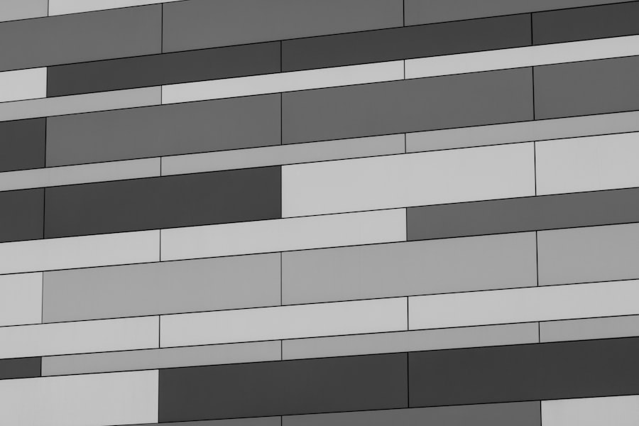
Utilizing Grid Systems for Consistency and Balance
Consistency and Cohesion
For example, many popular frameworks like Bootstrap and Foundation utilize grid systems to ensure that elements align properly, creating a cohesive look throughout the site. In addition to promoting consistency, grid systems also facilitate responsive design.
Adapting to Different Devices
As users access websites on various devices with different screen sizes, grids can adapt fluidly to maintain balance and proportion. This adaptability is crucial in today’s digital landscape, where mobile browsing has surged.
Improved User Experience
By employing a grid system, designers can ensure that their layouts remain visually appealing and functional, regardless of the device being used. This not only improves user experience but also contributes to better engagement and retention rates.
Creating Visual Hierarchy with Typography and Color

Visual hierarchy is a fundamental principle in web design that helps guide users through content by establishing an order of importance. Typography plays a pivotal role in this process; different font sizes, weights, and styles can signal to users which elements are most significant. For instance, using larger headings for titles and smaller fonts for body text creates a clear distinction between various levels of information.
This hierarchy allows users to scan content quickly, identifying key points without having to read every word. Color also contributes significantly to visual hierarchy. Designers can use contrasting colors to draw attention to specific elements, such as call-to-action buttons or important announcements.
For example, a bright red button on a muted background can stand out dramatically, prompting users to take action. Additionally, color can evoke emotions and set the tone for the website; warm colors may create a sense of urgency, while cooler tones can convey calmness and professionalism. By thoughtfully combining typography and color, designers can create a compelling visual hierarchy that enhances user engagement and facilitates effective communication.
Incorporating White Space for Improved Readability
White space, often referred to as negative space, is an essential component of effective web design that is frequently overlooked. It refers to the empty areas surrounding elements on a page, which can significantly impact readability and user experience. By incorporating adequate white space, designers can create breathing room around text and images, allowing users to focus on individual components without feeling overwhelmed.
This is particularly important in content-heavy websites where dense blocks of text can deter readers. Furthermore, white space helps establish relationships between different elements on a page. For instance, grouping related items with sufficient spacing can signal to users that these components are connected, enhancing their understanding of the content structure.
Additionally, white space can guide users’ attention toward key areas of interest or action points, such as sign-up forms or promotional banners. By strategically utilizing white space, designers can create layouts that are not only visually appealing but also functional and easy to navigate.
Balancing Symmetry and Asymmetry for a Dynamic Design
The interplay between symmetry and asymmetry is a powerful tool in web design that can create dynamic and engaging layouts. Symmetrical designs often evoke feelings of stability and order; they are visually pleasing and easy for users to process. For example, a symmetrical layout might feature evenly spaced columns with equal-sized images and text blocks, creating a sense of balance that is comforting to the eye.
On the other hand, asymmetrical designs introduce an element of surprise and creativity. By intentionally placing elements off-center or varying their sizes, designers can create visual interest and draw attention to specific areas of the page. This approach encourages exploration and engagement as users navigate through the content.
A well-executed asymmetrical layout can convey energy and modernity, appealing to audiences looking for innovative experiences. Striking the right balance between these two approaches allows designers to craft unique layouts that resonate with users while maintaining clarity and functionality.
Using Responsive Design to Adapt to Different Devices
Key Elements of Responsive Design
Responsive design employs fluid grids, flexible images, and media queries to adjust content dynamically based on the user’s environment. This allows websites to adapt to different devices and screen sizes, ensuring that the content is displayed in an optimal way.
Benefits of Responsive Design
The benefits of responsive design are numerous. For instance, a responsive website might rearrange its layout when viewed on a mobile device by stacking elements vertically rather than horizontally. This not only enhances usability but also improves load times, as mobile users often have slower internet connections. Additionally, responsive design contributes positively to search engine optimization (SEO), as search engines favor mobile-friendly sites in their rankings.
Creating Inclusive Experiences
By prioritizing responsive design principles, web designers can create inclusive experiences that cater to diverse user needs while maximizing reach and engagement. This approach ensures that websites are accessible and usable by everyone, regardless of the device or screen size they use.
Implementing User-Friendly Navigation for Seamless Interaction
Effective navigation is critical in web design as it directly impacts how users interact with a site. A user-friendly navigation system allows visitors to find information quickly and intuitively without feeling lost or frustrated. Clear labeling of menu items is essential; using familiar terms helps users understand where they will be directed when they click on links.
For example, using “About Us” instead of “Company Profile” makes it immediately clear what information will be found there. Moreover, navigation should be consistent across all pages of a website to reinforce familiarity as users explore different sections. Dropdown menus or mega menus can be employed for sites with extensive content, allowing users to access subcategories without overwhelming them with choices at first glance.
Additionally, incorporating breadcrumb navigation provides users with context about their current location within the site hierarchy, enabling them to backtrack easily if needed. By focusing on user-friendly navigation design principles, web designers can enhance usability and ensure that visitors have a seamless interaction with the site.
Optimizing Load Times with Efficient Layouts
Website load times are critical factors influencing user experience and retention rates. Research indicates that even a one-second delay in loading time can lead to significant drops in user satisfaction and conversion rates. Therefore, optimizing layouts for speed is essential in web design.
Efficient layouts minimize unnecessary elements that could slow down loading times while ensuring that essential content remains accessible. One effective strategy is to prioritize above-the-fold content—elements visible without scrolling—by loading them first while deferring less critical resources until later. Additionally, optimizing images through compression techniques can drastically reduce file sizes without sacrificing quality.
Utilizing CSS instead of images for certain design elements can also enhance performance by reducing HTTP requests. By implementing these strategies within their layouts, designers can create fast-loading websites that keep users engaged rather than frustrated by slow performance.
Incorporating Visual Cues for Intuitive User Experience
Visual cues are instrumental in guiding users through a website’s interface by providing subtle hints about how to interact with various elements. These cues can take many forms—such as arrows indicating direction or icons suggesting actions like downloading or sharing content. By incorporating these visual indicators into layouts, designers can enhance usability and create intuitive experiences that require minimal explanation.
For example, hover effects on buttons or links signal interactivity; when users hover over an element and see it change color or size, they are more likely to engage with it. Similarly, using icons alongside text labels can help convey meaning quickly; for instance, a shopping cart icon next to “Add to Cart” reinforces the action’s purpose visually. By thoughtfully integrating visual cues into web layouts, designers can facilitate smoother interactions and empower users to navigate confidently through the site.
Testing and Iterating for Continuous Improvement
The process of web design does not end once a site is launched; continuous testing and iteration are vital for maintaining relevance and effectiveness over time. User feedback plays an essential role in this process; gathering insights through surveys or usability testing helps identify pain points within the layout that may hinder user experience. For instance, if users consistently struggle to locate specific information or navigate certain sections, designers can make informed adjustments based on real-world interactions.
A/B testing is another valuable method for evaluating different layout variations against one another. By presenting two versions of a page to different user groups and analyzing engagement metrics such as click-through rates or time spent on page, designers can determine which layout performs better in achieving desired outcomes. This iterative approach fosters an environment of continuous improvement where designs evolve based on user needs rather than assumptions alone.
Staying Updated on Design Trends and Best Practices for Layout
The field of web design is ever-evolving; staying updated on current trends and best practices is crucial for designers aiming to create effective layouts that resonate with modern audiences. Emerging technologies such as artificial intelligence (AI) are influencing design processes by enabling personalized experiences tailored to individual user preferences. Additionally, trends like minimalism emphasize simplicity and functionality over excessive ornamentation—encouraging designers to focus on core content delivery.
Furthermore, accessibility standards are becoming increasingly important in web design discussions; ensuring that layouts accommodate users with disabilities is not only ethical but also expands reach within diverse audiences. Familiarizing oneself with guidelines such as the Web Content Accessibility Guidelines (WCAG) helps designers create inclusive experiences that cater to all users regardless of their abilities or limitations. By actively engaging with industry resources—such as design blogs, webinars, or conferences—designers can remain informed about new tools and techniques while refining their skills over time.
Embracing ongoing education ensures that layouts remain relevant amidst changing user expectations while fostering innovation within the field of web design itself.
When it comes to web design, having a well-thought-out layout is crucial for creating a user-friendly and visually appealing website. One article that delves into the importance of layout in web design can be found at uprankerz.com. This article discusses how the layout of a website can impact user experience and ultimately determine the success of a site. By understanding the principles of layout design, web designers can create websites that are easy to navigate and engaging for visitors. For more insights on this topic, be sure to check out the article at uprankerz.com.
FAQs
What is layout in web design?
Layout in web design refers to the arrangement of elements on a web page, including text, images, and other media. It involves organizing the content in a visually appealing and user-friendly manner.
Why is layout important in web design?
Layout is important in web design because it affects the overall user experience. A well-organized layout can make it easier for users to navigate a website, find information, and understand the content. It also contributes to the aesthetic appeal of the site.
What are some common layout techniques in web design?
Common layout techniques in web design include grid-based layouts, responsive design, and the use of whitespace. Grid-based layouts help to align and organize content, while responsive design ensures that the layout adapts to different screen sizes. Whitespace is used to create visual breathing room and improve readability.
How does layout impact user experience?
The layout of a website can impact user experience in several ways. A well-organized layout can make it easier for users to find information, navigate the site, and understand the content. On the other hand, a cluttered or confusing layout can frustrate users and lead to a negative experience.
What are some best practices for creating an effective layout in web design?
Some best practices for creating an effective layout in web design include using a grid system for alignment, prioritizing content based on importance, maintaining consistency throughout the site, and optimizing for mobile devices. It’s also important to consider the visual hierarchy and use whitespace effectively.